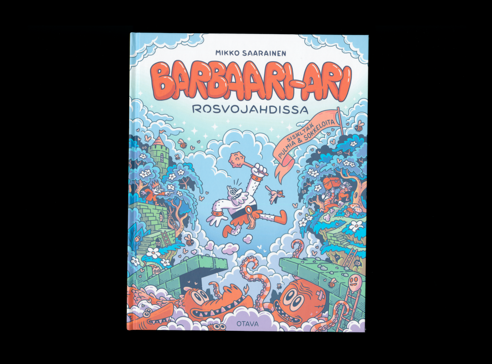
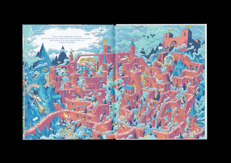
Mikko Saarainen
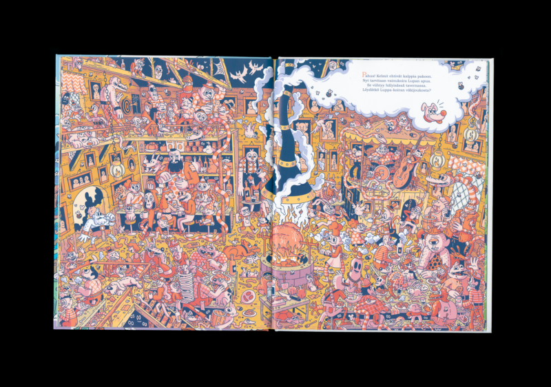
Barbaari-Ari rosvojahdissa
- Format 230 × 290 mm
- Pages 30
- Printing Otavan Kirjapaino
- Paper G-Print
- Typefaces Bookman Old Style
- Published by Otava
- Design Mikko Saarainen
- Illustration Mikko Saarainen
- Reproduced by Aste Helsinki
The book is built upon diverse, detailed and playful illustration. Its dizzyingly labyrinthine visual narrative invites the reader to explore, while maintaining a consistently high visual quality throughout the adventure. Colour usage forms the backbone of the book, evident in both text and image. Meticulously realised work remains harmonious despite its complexity.
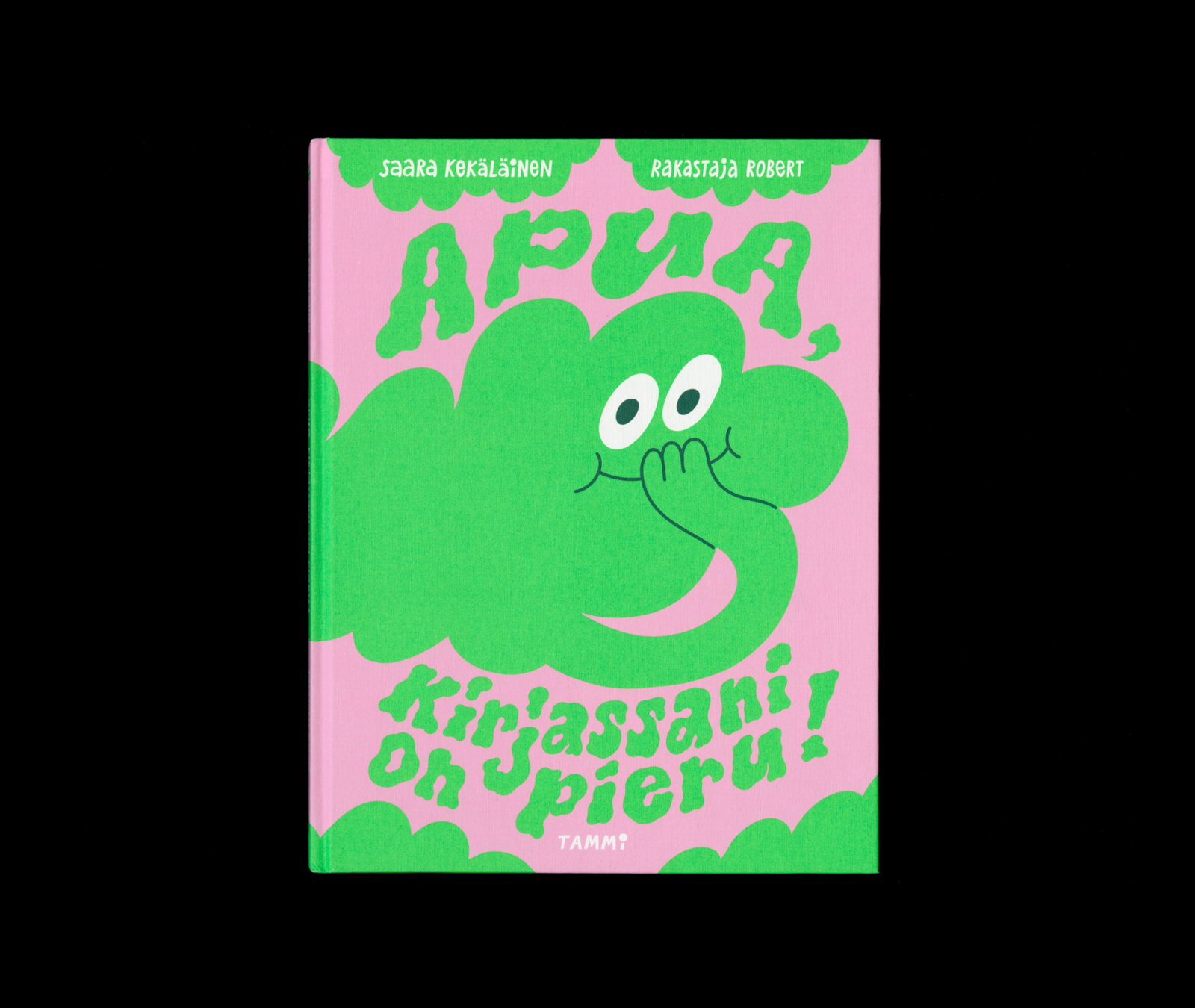
Saara Kekäläinen, Rakastaja Robert
Apua, kirjassani on pieru
- Format 227 × 294 mm
- Pages 48
- Printing Livonia Print
- Paper Lessebo Zero Offset
- Typefaces n/a
- Published by Tammi
- Design Rakastaja Robert (Robert Lönnqvist)
- Illustration Rakastaja Robert (Robert Lönnqvist)
- Reproduced by Keski-Suomen Sivu
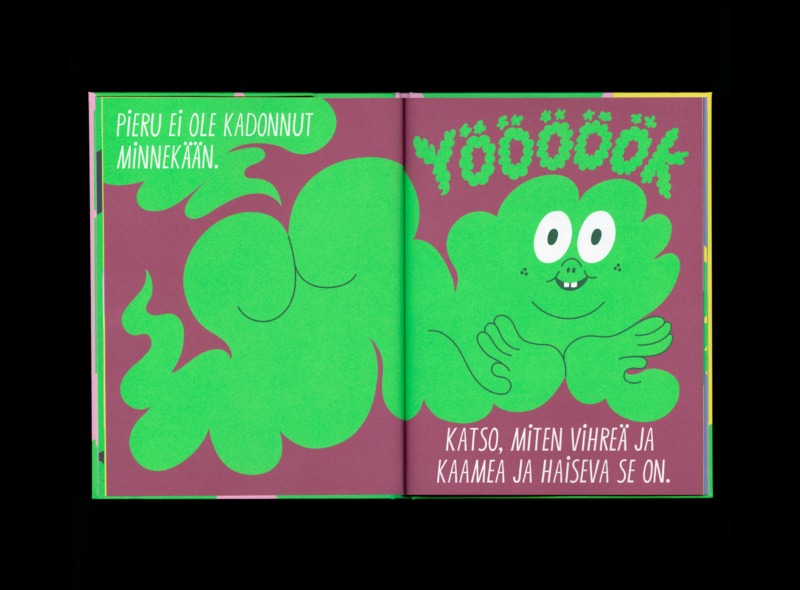
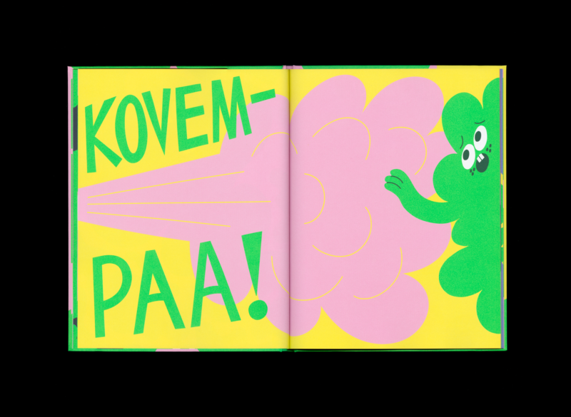
A contemporary and refreshing whole, tied together by bold illustration and a playful handling of colour. The book’s unique, lively typeface effectively complements the format. The execution is a brilliant example of restrained maximalism. The limited colour palette, with its use of contrasts, is an effective choice. The book invites the reader’s vision into a joyful play.
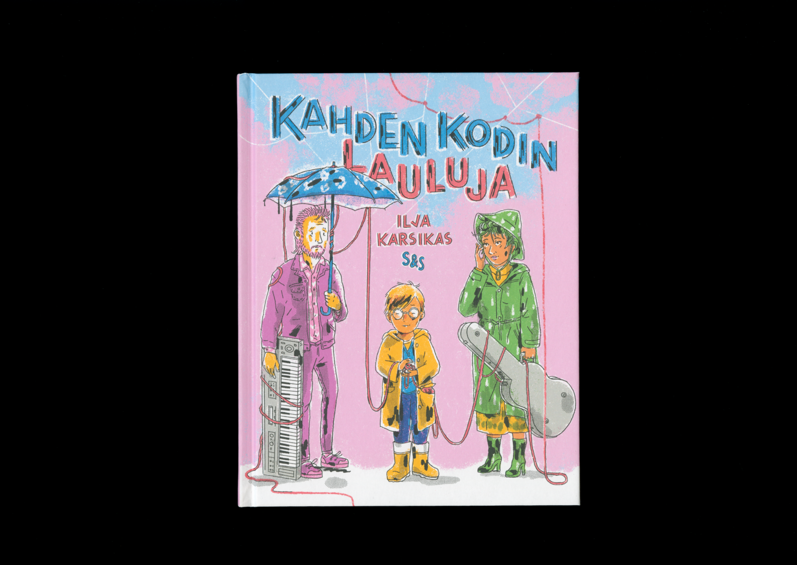
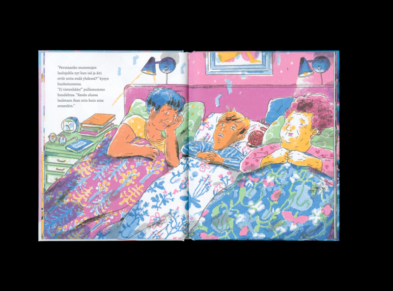
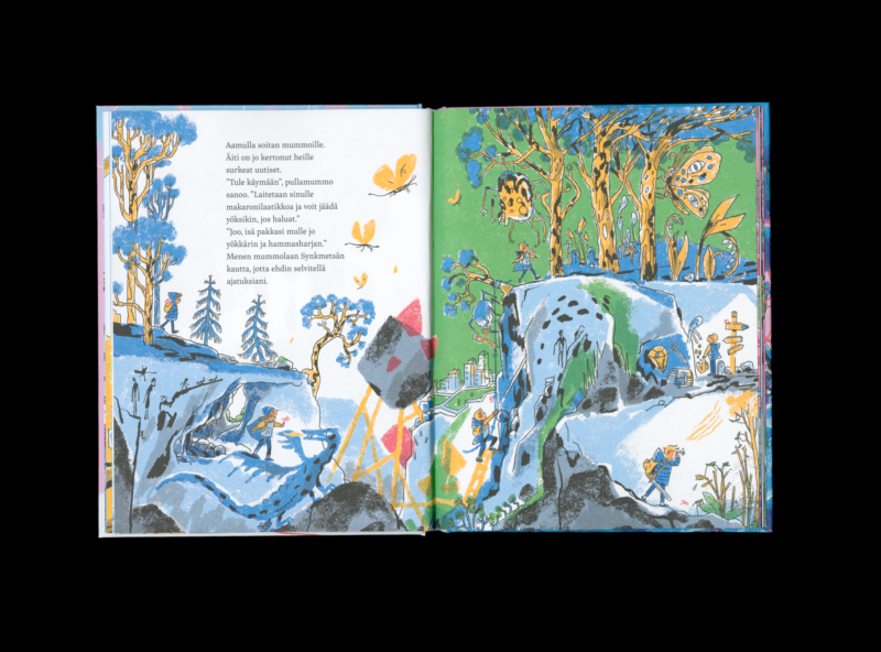
Ilja Karsikas
Kahden kodin lauluja
- Format 182 × 232 mm
- Pages 48
- Printing Jelgavas Tipogrāfija
- Paper Munken Lynx Rough, Geltex SEDA 111
- Typefaces Inka A Text, Intervogue Soft
- Published by Kustantamo S&S
- Design Ilja Karsikas
- Illustration Ilja Karsikas
- Reproduced by Jelgavas Tipogrāfija
The cover material has a firm and clear haptic feel. In the digital illustrations, the coloured areas are produced with a pen that imitates the softness of chalk, while the shadows are created with ink-like strokes and stippling. This creates an interesting tension and structure to the book. The visual storytelling is layered and rich in intriguing detail. Carefully considered typography brings the whole together.

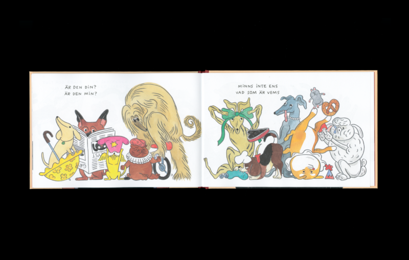
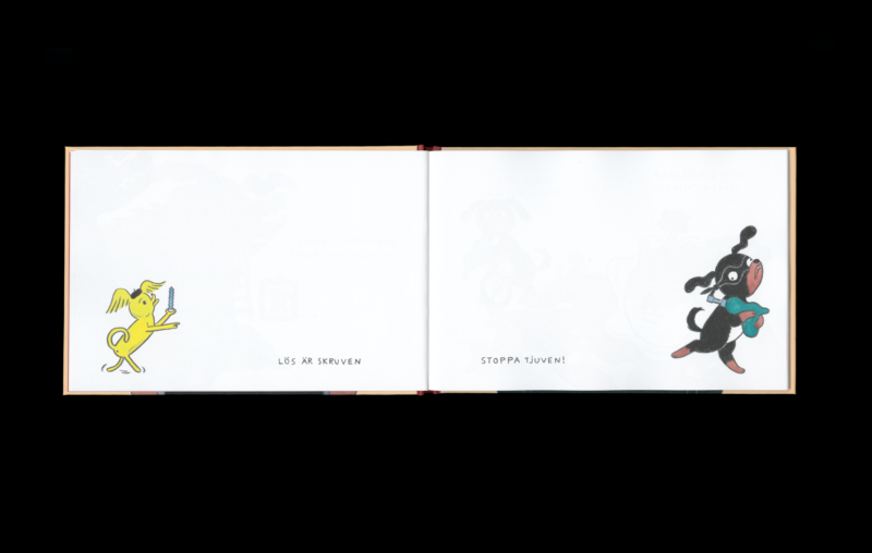
Ulla Donner
Stoppa tjuven!
Pysäyttäkää voro!
- Format 240 × 160 mm
- Pages 40
- Printing Jelgavas Tipogrāfija
- Paper Munken Lynx Rough
- Typefaces n/a
- Published by Schildts & Söderströms, Kustantamo S&S
- Design Ulla Donner
- Illustration Ulla Donner
- Reproduced by Jelgavas Tipogrāfija
The landscape format fits perfectly with the exhilarating story. The rhythm of the illustration and text is carefully considered and consistently delightful. The illustrative style creates distinctive characters, while the lines support the liveliness of the expression. As the story unfolds, the rhymes and visual world gather pace, moving from an unhurried opening to a swifter tempo. The book’s energy and good vibes immediately carry over to the reader.
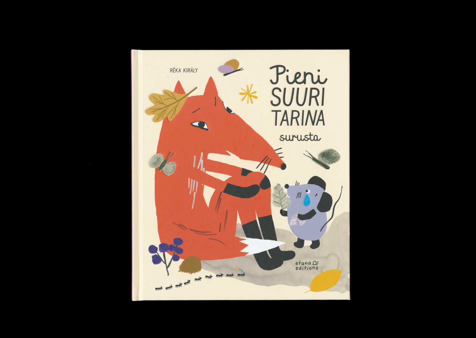
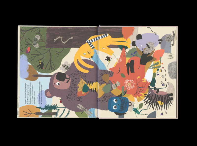
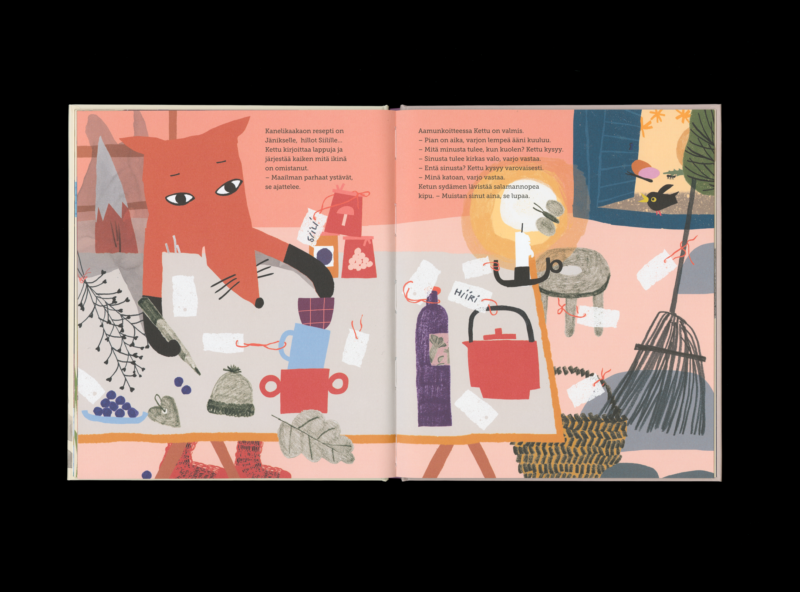
Réka Király
Pieni suuri tarina surusta
- Format 195 × 224 mm
- Pages 32
- Printing Jelgavas Tipogrāfija
- Paper Maestro Print
- Typefaces Museo Slab, Geli, Mrs White Etana Editions
- Published by Etana Editions
- Design Réka Király
- Illustration Réka Király
The embossing on the cover acts as a subtle anchor: by touching it, the reader holding the book finds a sense of support and comfort. The use of muted, autumnal tones is thoughtfully chosen to complement the themes of grief and death. The illustrations dynamically combine analogue and digital techniques, demonstrating the artist’s design expertise.