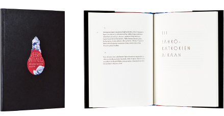
Veera Antsalo
Sähkökatkoksen aikaan
- Published by Teos Publishing
- Graphic design Jenni Saari
- Printed and bound by MeediaZone, Estonia
- Paper Munken Pure 100 g/m2
- Typeface Mostra Nuova, Adobe Caslon Pro
The visual image of the book is based on fascinating contrasts. The shape of the light bulb skillfully die-cut on the black cover gets its background from the abundantly colored collage on the inside cover. Revealed underneath the dustjacket is a sensitive and dreamlike imagery. The layout and composition of this poetry book play around with subtle nuances. The distinctive style of heading calls to mind the 1940s and effectively counterbalances the Antiqua of the body text.
Vesa Haapala
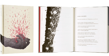
Kuka ampui ötzin?
- Published by Otava Publishing Company Ltd.
- Graphic design Markus Pyörälä
- Reproduced by Aste Kirjat Oy
- Printed and bound by Otavan Kirjapaino Oy
- Paper Lux Cream 80 g/m2
- Typeface ScalaSans, Scala
Blood splashes on the cover, with a stopping impact – no words, names or titles. The text and illustrations converse, disperse, crawl, escape, expand from stem cell into a universe. The book, testing the boundaries between poetry and image, sarcastically marvels at human existence and the ill state of society. The text proceeding in different poetical meters, airy layout, typography and graphic illustrations are skillfully intertwined and call forth questions to haunt the mind.
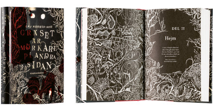
Kaj Korkea-Aho
Gräset är mörkare på andra sidan
- Published by Schildts & Söderströms
- Graphic design Emma Strömberg
- Cover design Sanna Mander
- Printed, bound and reproduced by InPrint, Latvia
- Paper Holmen Book Cream 70 g/m2
- Typeface Crimson
Black and red, the traditional primary colors of bookprinting, are handsomely deployed in the service of the text. The illustration is simultaneously sullen and playful, and the dark-toned illustrations are delightfully used also as chapter opening spreads. This gives a brilliant rhythm to the book. The text pages are beautifully laid out, the margins are sufficiently wide and the text is suitably sized. The stain of blood glimmering red on the front cover makes the fingers tingle.
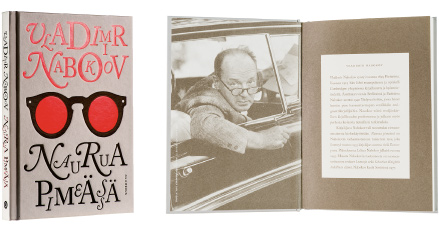
Vladimir Nabokov
Naurua pimeässä
- Published by Gummerus Publishers
- Graphic design Jenni Noponen
- Printed by Bookwell Oy
- Paper Munken Premium Cream 100 g/m2
- Typeface Adobe Caslon Pro, Gotham Book
This Nabokov book feels absolutely perfect to hold: in size, weight and surface material. The streamlined imagery and all the texts are printed in matte black and shiny red foil, and that’s all the book needs. The carefully chosen photo and bio of the writer, printed in warm gray on the inside cover are compelling. The text itself is also very pleasant to read.
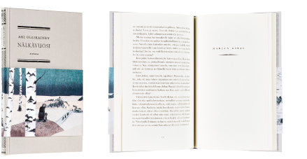
Aki Ollikainen
Nälkävuosi
- Published by Siltala Publishing
- Graphic design Elina Warsta
- Printed by Bookwell Oy
- Paper Ensolux Cream 70 g/m2
- Typeface Baskerville Old Face, Perpetua Titling
This impressive reading experience is evocatively designed to look its age. The material choices and typeface consistent with the spirit of the “hunger years” create an atmosphere of shortage. The spine, endpages, title page and chapter headings draw from the ornamental style of works of print from the 19th century.
