Jaakko Heikkilä
Veden kätkemiä huoneita
- Published by Maahenki Oy / Musta Taide
- Graphic design Timo Numminen
- Photography Jaakko Heikkilä
- Reproduced by Petri Kuokka / Aarnipaja Ky
- Printed and bound by Bookwell Oy
- Paper Arctic Volume Ivory 150g
- Typeface Perpetua, Gotham
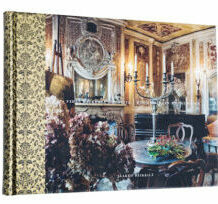
Photographing the palaces of the nobility in Venice and the furniture within, demand a slightly bourgeoisie touch. Yet it’s not right to scare off the reader with excessive snobbery or too many frills. The book lifts up the depth of field in Jaakko Heikkilä’s photos, but keeps the extravaganza in leash the same way the self-sufficient high and mighty might do. True quality carries its own sign.
Catarina Ryöppy
Metro #4 Paris
- Published by Maahenki Oy / Musta Taide
- Graphic design Jorma Hinkka
- Photography Catarina Ryöppy
- Reproduced by Timo Lagerström
- Printed by Lönnberg Painot Oy
- Bound by Finnreklama Oy
- Paper Galerie Art Volume 150g
- Typeface Garamond, Garamond Premier Pro
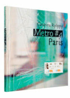
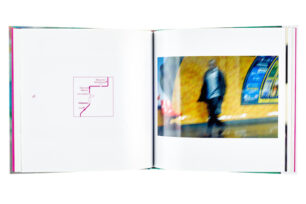
A book of ideas larger than its size, the material saddled to serve pictorial storytelling. Various lacquers turn these – not so great in a traditional sense – glimpses of photos noble and unique. The pacing of pictures recreates the movement of a metro train, and the ticket embedded in the cover takes one’s mind to Paris.
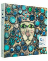
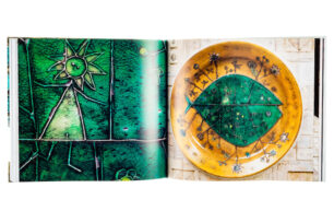
Harri Kalha
Rut Bryk - Elämän taide
- Published by EMMA – Espoo Museum of Modern Art
- Graphic design Anne Kaikkonen / Timangi
- Photography Ari Karttunen / EMMA, Ella Tommila / EMMA
- Reproduced by Kari Lahtinen / Kustannushuone Oy
- Printed and bound by Bookwell Oy
- Paper Arctic Matt
- Typeface Didot Elder, Apex New, Apex Serif
The cover sets its trust on one example of the very original approach of the artist: the Lion looks the reader straight in the eye. The flyleaf becomes quietly a part of the cover. The shape, size and materials create an approachable book, yet a monument worthy enough to commemorate the important artist. The layout is warm and spirited.
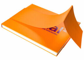
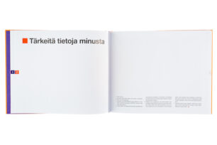
Shunsuke Ohno - Dmitry Sokolenko
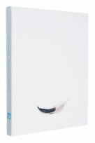
Fractal2
- Published by Parvs Publishing
- Graphic design Teemu Junkkaala
- Photography Shunsuke Ohno
- Reproduced by Jussi Tiainen
- Printed and bound by Bookwell Oy
- Paper G-Print 150g
- Typeface Helvetica Neue
Hiding the name of the book from the cover is such a rare idea that it must open the eyes: the cover relies on strong colour. The opposite colour on the flyleaves rises to challenge the harmony of the cover. The format is challenging too, but this time just right for the content. The choice of materials works out. The last refining touches on the typography have been left out, but the laconic Helvetica is a good choice for this specific book.
EMMA - Espoon modernin taiteen museo
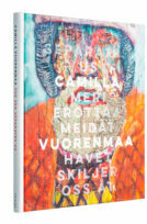
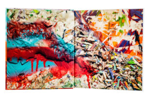
Camilla Vuorenmaa: Meri erottaa meidät
- Published by EMMA – Espoo Museum of Modern Art
- Graphic design Jussi Karjalainen / Studio Super8
- Photography Ari Karttunen / EMMA
- Reproduced by Asko Rokala / Bee2 Oy
- Printed by Lönnberg Print & Promo
- Bound by Finnreklama Oy
- Paper Galerie Art Volume 150g
- Typeface Lulo Clean, Trade Gothic, Adobe Garamond
All the bits and pieces on this exhibition book snap into their places. The rough and colourful works of Camilla Vuorenmaa controlledly blaze through the book. Both the layout and the colour scheme support the pictorial parade. Text is clear and vigorous, with elegant nuances, respecting both the reader and the artist.
Pirkko Tuukkanen (Toim./Ed.)
Jussi Heikkilä. Observationes 1984-2016
- Published by Suomen Taideyhdistys ry
- Graphic design Minna Luoma / Candy Graphics Oy
- Reproduced by Petri Kuokka / Aarnipaja Ky
- Printed and by Lönnberg Oy
- Bound by Finnreklama Oy
- Paper Galerie Volume 170g
- Typeface Scala Sans
A classic art book, taking advantage of the open space with quiet typography and well-measured rhythm. Pictures are grand, as they well should be in this kind of tome, and innovative thought has been put into insertions. The blank minimalism starts unapologisingly from the cover on and continues through the book. Meticulous care is present on every spread.
Arja Karhumaa
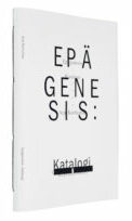
Epägenesis : Katalogi
- Published by Ama Design
- Graphic design Arja Karhumaa
- Printed by Aldus Oy
- Bound by Esko Salonen / Mestarinkirja
- Paper Cyclus Offset
Epägenesis, the un-genesis, points out how the typography and form affect the written content. The results also display how books as objects convey the messages built on convention and tradition. A soft-covered, stapled catalogue feels vastly different from a hard-cover novel. This book-object with all its material choices and bindings is exactly right for its content: innovations packaging innovations.
