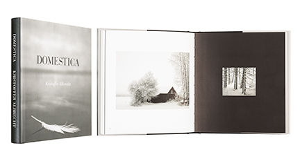
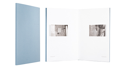
Kristoffer Albrecht
Domestica
- Published by Maahenki Oy / Musta Taide
- Graphic design and photography Kristoffer Albrecht
- Reproduced by Kristoffer Albrecht
- Printed and bound by Bookwell Oy
- Paper Arctic Volume Ivory 150 g/m2
- Typeface Bauer Bodoni
This small and quiet tome observes the familiar landscape, and the skill to observe the minimal changes within. Photo-narrative gains an extra dimension from airy drawings that accentuate the peaceful entirety. The conventional dust jacket reveals a charming cover with foil pressed drawings
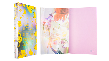
Johanna Bruun - Ida Enegren
OPEN - On Thai massage windows in Finland
- Published by Bruun & Enegren
- Graphic design Johanna Bruun
- Photography Ida Enegren
- Printed, reproduced and bound by Petro ofsetas UAB
- Paper Arctic Volume White 150 g/m2, Scandia 2000 White
- Typeface JS-Yodthida, Custom font Phuket by Markku Mujunen
Behind the transparent, window-like dust jacket begins an exploration into the esthetics of Thai massage parlors. A photo reportage book challenges the preconceptions on good taste, style and beauty. It brings forward the ladies working the parlors, the decorators of the windows. Photographs, pictorial journalism, interviews and an essay, the shape, open spine with sheet numbers, choices of colours and the custom Phuket typeface create a unique entity.
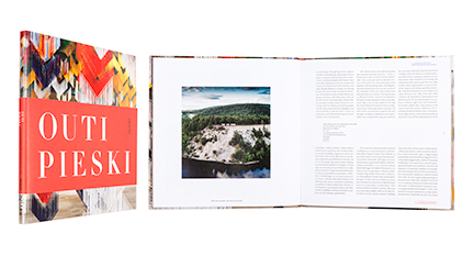
Milja Liimatainen - Emma Lilja - Arja Miller - Pernilla Wiik (Toim.)
Outi Pieski - Cuolmmadit
- Published by EMMA – Espoo Museum of Modern Art
- Graphic design Jussi Karjalainen
- Reproduced by Asko Rokala / Bee2
- Printed and bound by Grano Oy
- Photography Ari Karttunen / EMMA
- Paper Galerie Art Volume 150 g/m2
- Typeface Minion
Attention is drawn on how the pages of this art book carry two languages simultaneously, as on both sides of the horizon. The solution creates a kind of a landscape, a space that continues on the beautiful works of art. The informative use of red and blue lifted straight from the art combines measuredly the elements of the book.
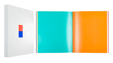
Maaretta Jaukkari - Leena Kuumola - Pontus Kyander - Jyrki Siukonen - Marko Vuokola
Marko Vuokola
- Published by Garret Publications
- Graphic design Ilona Ilottu / Dog Design
- Reproduced by Petri Kuokka / Aarnipaja
- Printed and bound by Livonia Print Ltd.
- Paper Arctic Volume White 170 g/m2, Curious Matter Adiron Blue & Desiree red 135 g/m2
- Typeface Libre Baskerville
Extended tome on the visual art of Marko Vuokola up to this day is a work of art in itself. Meticulously designed book is free from clutter and the form is one with the content. Minimalistic calico jacket, blind stamping, golden x on the back cover, intensive flyleaves, sharp print and lacquered images reach for perfection.
Natalia Kopkina
Mame
- Published by I am not Publishing
- Graphic design Nicolai Angelov
- Reproduced by Petri Kuokka / Aarnipaja
- Printed by Grano Oy
- Bound by Juha Markula
- Photography Natalia Kopkina
- Paper Munken Lynx 100 g/m2
- Typeface Literaturnaya
A greyish-blue hand-stitched thread ties these, on their top edge uncut sheets, into a book. Glued inside the book are photographs that glow and tremble in small bits or open wide. The translations for the Russian texts, themselves hidden behind the spreads, can be found on the thin, thin sheet tucked between the pages. This is an uncompromising, soulful work of art, its technical details painstakingly attended to, a true pearl among book art.
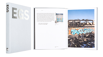
Pirkko Tuukkanen (Toim./Ed.)
EGS
- Published by Finnish Art Society
- Graphic design Janne Hänninen / Agency Leroy
- Reproduced by Yasmin Eklund / Agency Leroy
- Printed and bound by Grano Oy
- Photography EGS
- Paper Munken Polar Rough 120 g/m2, Galerie Volume 150 g/m2
- Typeface Theinhardt Medium
The strict form of an exhibition catalogue is an excellent platform for the lush productivity of a graffiti artist. An elegant grey cover, silver foiled cover typeset and the silver edges of the block create both a contrast and a connection to the works of the artist. A controlled use of space and pictorial, the sturdy typography and interchanging coated and uncoated pages create a postured rhythm.
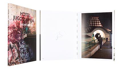
Sakari Viika
Hotel Jugoslavija
- Published by Sémiosquare
- Graphic design Jorma Hinkka / Graafiset Neliöt
- Photography Sakari Viika
- Reproduced by Petri Kuokka / Aarnipaja
- Printed and bound by Tallinna Raamatutrükikoja Oü
- Paper Galerie Art Silk 170 g/m2
- Typeface Jigsaw Stencil, Zeitung Pro
This book presenting the streets of Belgrade is designed with respect towards the photographs and uses them as the starting point, creating a clashing contrast between their dark malform and the open white space of the pages. The black thread of the binding converses interestingly with the sensitive map drawings.
