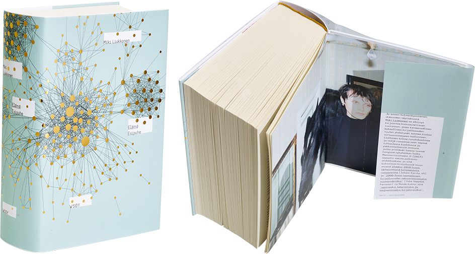
Miki Liukkonen
Elämä: Esipuhe
- Published by WSOY
- Graphic design and illustration Jussi Karjalainen
- Reproduced by Keski-Suomen Sivu Oy
- Printed and bound by ScandBook
- Paper Enso Creamy FSC 60 g/m2
- Typeface Minion Pro, American Typewriter
This stout volume is lightened by a striking but ethereal dust jacket. Arresting author photos make an interesting combination with the visual rhythm of the cover art and flaps. The ordinary style of the title page and interior dampens the otherwise so well-deliberated overall effect.
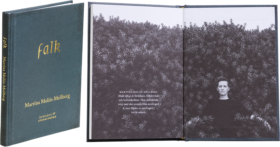
Marina Moliis-Mellberg
falk
- Published by Schildts & Söderströms
- Graphic design Emma Strömberg
- Printed, reproduced and bound by Printall AS
- Paper Munken Polar 130 g/m2
- Typeface Rieven Uncial, Williams Caslon Text
The thoughtful form of this minimalist chapbook is a dignified vessel for its stripped-down content. Smart use of the author photo rounds off the clean design.
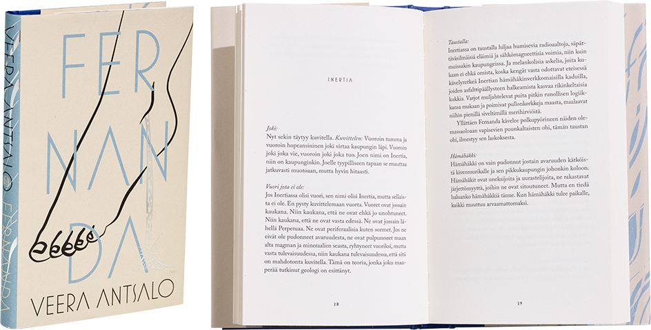
Veera Antsalo
Fernanda
- Published by Kustannusosakeyhtiö Teos
- Graphic design Jenni Saari
- Printed, reproduced and bound by Meediazone OÜ
- Paper Holmen Book Cream 80 g/m2
- Typeface Adobe Caslon Pro, Mostra Nuovo
Fernanda is a small and visually understated work whose imaginative and harmonious graphic elements have been balanced with an excellent eye. The illustration and typography, thoughtful use of foil and delicate colour scheme result in a cover that invites touch and close examination. When a designer commits to it, subtlety can produce powerful results – it’s not necessary to shout to stand out from the crowd.
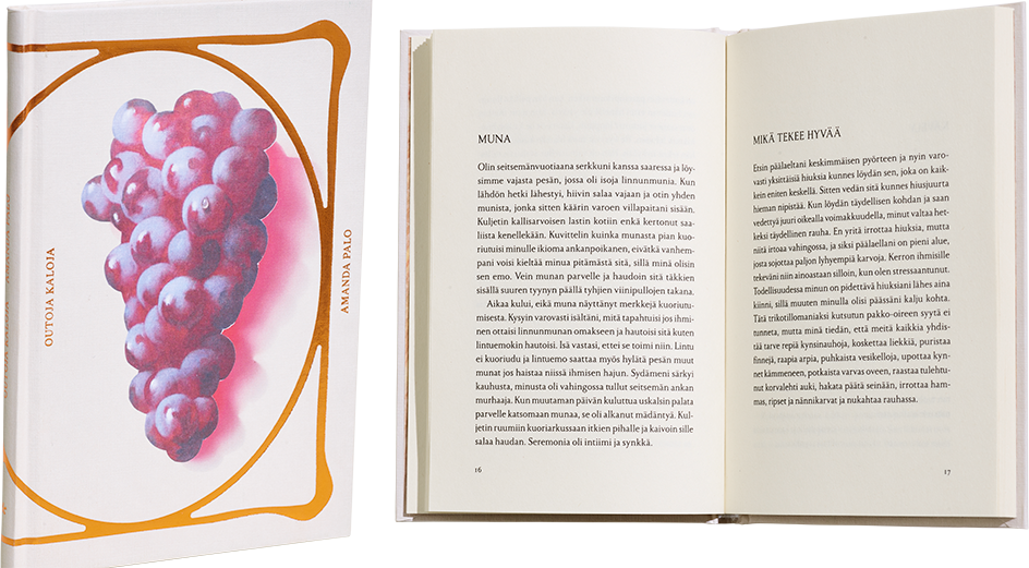
Amanda Palo
Outoja kaloja
- Published by Kustannusyhtiö Kosmos
- Graphic design Viivi Prokofjev
- Photography Meri Björn
- Reproduced by Keski-Suomen Sivu Oy
- Printed and bound by ScandBook
- Paper Enso Creamy 60 g/m2
Outoja kaloja is a jewel and one of the most impressive artefacts of the year. This diminutive work gets under one’s skin, with the covers exuding mystery and hinting at the book’s many layers – the ‘strange fish’ of the title, grapes, a framing element that references art deco. The designer deserves praise for having stylishly broken the conventions of literary covers – with just a glance, the design sticks in one’s mind. Some small final adjustments could have been made to this gem, however; millimetres and even half millimetres are sometimes decisive.
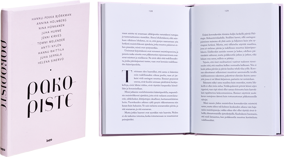
Hannu-Pekka Björkman – Nina Honkanen (eds.)
Pakopiste
- Published by Into Kustannus Oy
- Graphic design Emmi Kyytsönen
- Reproduced by Emmi Kyytsönen ja Antti Kukkonen
- Printed and bound by Livonia Print Ltd
- Paper Magno Natural 120 g/m2
- Typeface Jeanne Moderno OT, Mr Eaves San OT, Adobe Caslon Pro
The sophisticated look of this essay collection and the harmonious proportions of its cohesive layout help settle the reader when approaching the book’s diverse content. The cover typography is airy and elegant.
