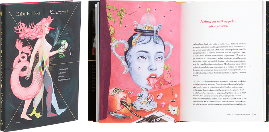
Kaisa Pulakka
Kurittomat – Jumalattaria, nykynaisia ja muita kauheita akkoja
- Published by Atena Kustannus Oy
- Graphic design Ville Lähteenmäki
- Cover graphic design and illustration Pauliina Mäkelä
- Reproduced by Pauliina Mäkelä ja Atena Kustannus Oy
- Printed and bound by Otavan Kirjapaino Oy
- Paper Edixion offset 140 g/m 2
- Typeface Adobe Garamond, Neutra Text
The history and present-day reality of women are wrapped in an exciting, relaxed cover. The adroit layout elegantly combines fabulous illustrations with historical images. The elastic and harmonious page design helps the reader slip easily into the text.
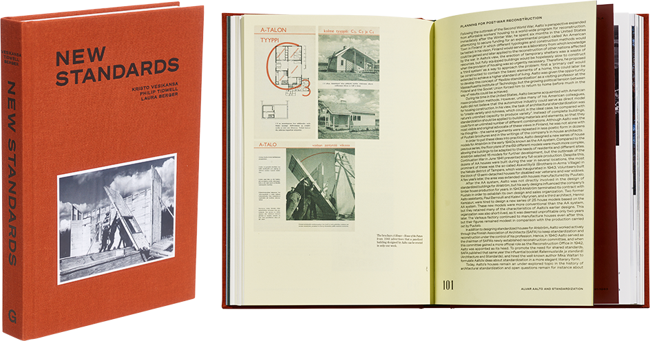
Kristo Vesikansa – Philip Tidwell – Laura Berger
New Standards
- Published by Garret Publications
- Graphic design Päivi Häikiö
- Photography Juuso Westerlund
- Printed, reproduced and bound by Livonia Print Ltd
- Paper Munken Pure, Arctic Volume Ivory
- Typeface Söhne Buch ja Breit, LTC Glamour, Century Old Style Std
This non-fiction book about mass-produced timber houses discusses architecture, post-war construction and everyday beauty with unmistakable clarity and quality. Period illustrations and an appropriate dose of information are intertwined in a rich and effective work, inviting the reader to delve in and stay.
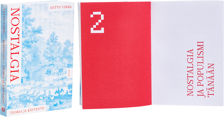
Antto Vihma
Nostalgia – Teoria ja käytäntö
- Published by Kustannusosakeyhtiö Teos
- Graphic design Anna-Mari Tenhunen
- Reproduced by Keski-Suomen Sivu Oy
- Printed and bound by Meedia Zone OÜ
- Paper Munken Lynx 300g/m2, Munken Lynx 120 g/m2
- Typeface Mondwest, Greta Text Pro, Neue Montreal
The book’s sensitive layout makes use of subtle contrasts, resulting in a masterful object that sits beautifully in the hand. The paper, the uncoated cover stock and two-colour cover printing are a powerful combination that delights with its simplicity. The unlikely font, drawing on pixel aesthetics, is the cherry on top of this skilfully executed layout.
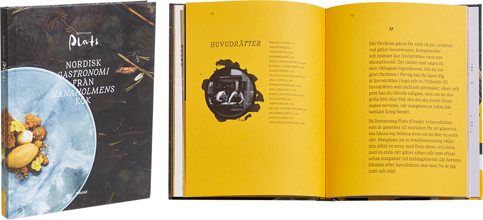
Lukas Hemnell – Nina Weckström
Restaurang Plats – Nordisk gastronomi från Hanaholmens kök
- Published by Förlaget M
- Graphic design and illustration Kobra Agency
- Photography Robert Lindström
- Printed, reproduced and bound by UAB BALTO print
- Paper Maestro print 140
- Typeface Hanaholmen
The cover of this work about the food philosophy of Restaurant Plats is harmonious, but a repeat of the usual Nordic visual narrative. However, the interior layout makes the work interesting: the sunny yellow colour, illustrations and well-conceived layout bring energy and visual interest. The powerful colour palette makes the content shine. The book’s size is overbearing, and it may have had more character in a smaller format.
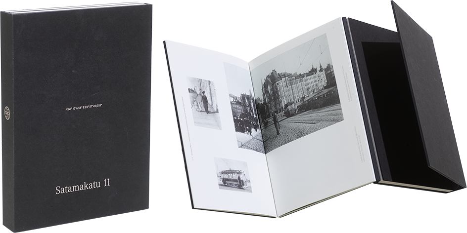
Satu Laatikainen
Satamakatu 11
- Published by SKS Kirjat
- Graphic design Cornelia Hellstern / München/D
- Illustration Aalto Real Estate Oy
- Photography Cornelia Hellstern, Petri Krook, Vilhelm Sjöström, Kirsi-Marja Savola
- Producer Aalto Real Estate / Teemu Oksanen
- Reproduced by LUDWIG:media gmbh
- Printed and bound by DZA Druckerei zu Altenburg DmbH
- Paper Fly 06 (extra white) 130 g/m2
- Typeface Brother 1816, Corporate A Pro
A wide variety of unusual technical solutions have been wrapped into this black package. Inside the covers are two books, showcasing the building in two different uses. The solution is clever from a conceptual perspective, but in the end, it would be better if the reader could remove the books from the cover-like construction. The paper, the exceptional print quality and the airy and beautifully meandering grid make up the soul of the work. The raw edges of the cut-flush binding bring the assertive black covers to life.
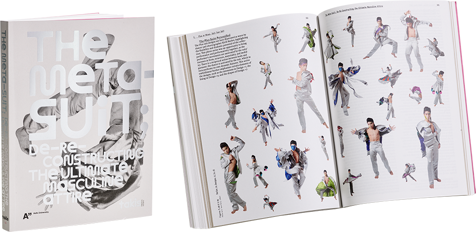
Panagiotis Chatoupis (Takis)
The Meta-Suit; de-re-constructing the ultimate masculine attire
- Published by Aalto ARTS Books
- Graphic design Tuomas Kortteinen
- Printed and bound by PunaMusta Oy
- Paper Scandia White 100 g/m2, Pop’Set Grey 170 g/m2
- Typeface Immortel Colera (205tf), Maxi Round (ABC Dinamo), Placard (OPS Type)
The striking cover of this dissertation is fresh and multidimensional. The abundant material has been skilfully arranged, and the strong, playful typography and clever use of images are a delight. The fonts have been chosen with an excellent eye, and the layout is elegant.
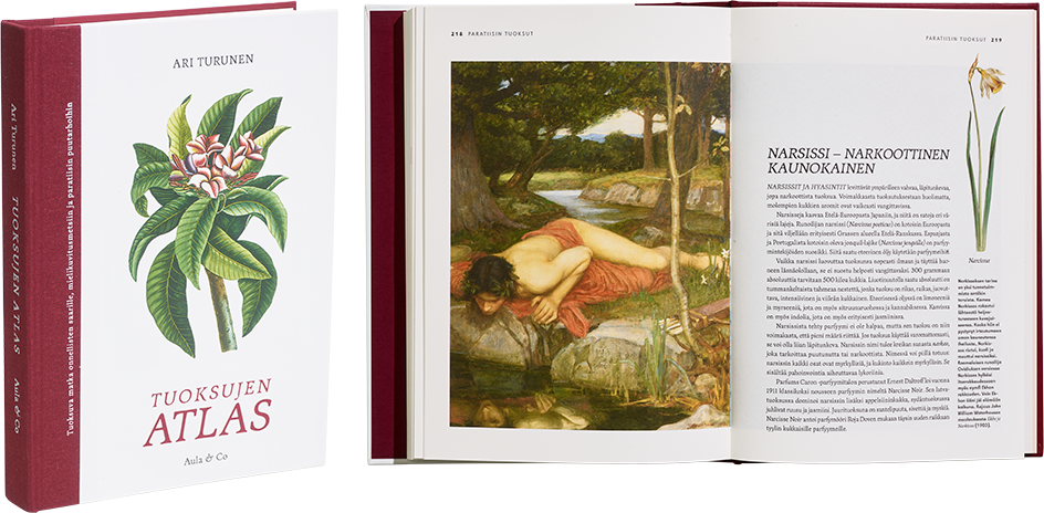
Ari Turunen
Tuoksujen atlas
- Published by Kustannusosakeyhtiö Aula & Co
- Graphic design Tuija Tarkiainen
- Printed, reproduced and bound by Jelgavas Tipogrāfija
- Paper Munken Lynx 120 g/m 2
- Typeface Nils / Helsinki Type Studio, Bookish
A wonderful source of information about a completely unknown area of history! What’s missing is scent itself… The plentiful information is presented clearly in an enjoyable, easy-to-open format. The size and material choices are on-point, but the layout calls for something more or new to enliven its restrained classicism. Overall, a stylish work.
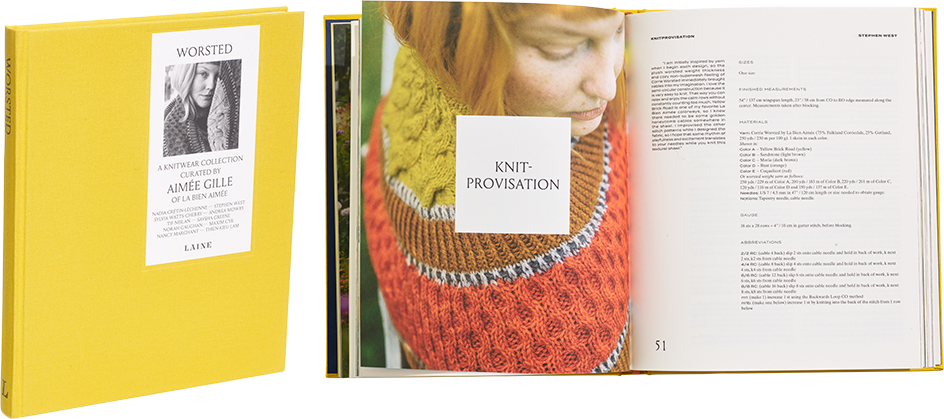
Aimée Gille
Worsted
- Published by Laine Publishing Oy
- Graphic design Päivi Häikiö
- Photography Jonna Hietala ja Sini Kramer
- Printed and bound by Livonia Print Ltd
- Paper Munken Pure 130 g/m2
- Typeface Baskerville, Louize Display, Minion, Spot Mono, TimesTen
Browsing this book will make your mouth water! Yarns are transformed into knits in delectable images that appeal to the senses. The appearance, covers and size of the book arouse the reader’s curiosity about the subject. The book’s knits and earth tones glow, beginning with the cover materials. The work succeeds as a pattern book for complex knitwear in both its elegance and usability.
