Laura Ruohonen – Linda Bondestam
Hela konkarongen / Konkkaronkka
- Published by Förlaget & Kustannusosakeyhtiö Otava
- Graphic design and illustration Linda Bondestam
- Other designer Emma Strömberg
- Reproduced, printed and bound by Jelgavas Tipogrāfija
- Paper Munken Polar Rough 150 g/m2, Efalin
- Typeface IM Fell DW Pica PRO
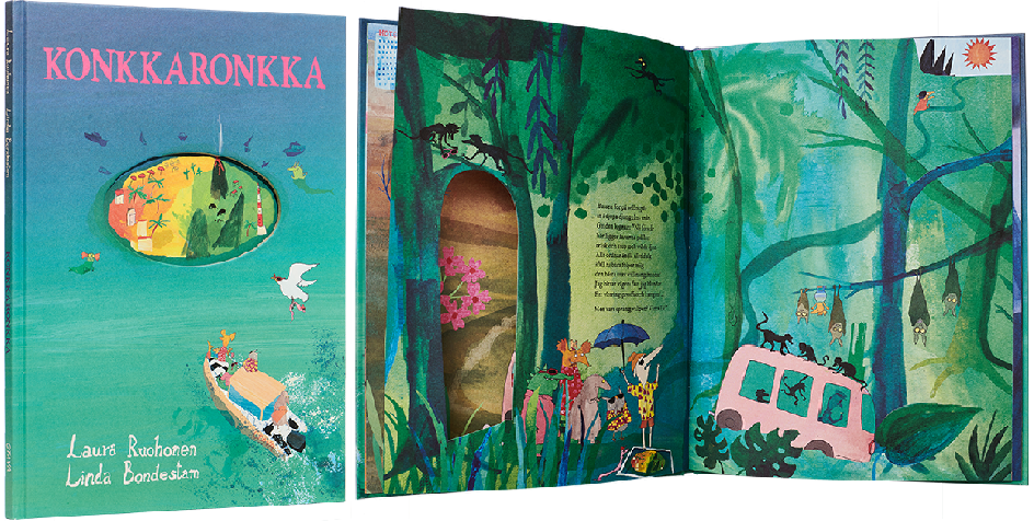
This expressive, colourful romp is captivating. The holes in the pages form delightful wormholes into the book’s spacetime, and the storytelling takes numerous unexpected turns. The high-quality technical production in both the printing and the finishing invites you to read the book with your hands as well as with your eyes.
Jenni Erkintalo
Kuka ihana?
- Published by Etana Editions
- Graphic design, illustration and reproduced by Jenni Erkintalo
- Printed and bound by Jelgavas Tipogrāfija
- Paper Inner pages: Serixo 170 g, Cover: Galerie Art silk 130 g
- Typeface Tomarik
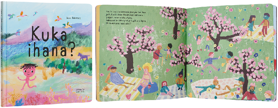
This picture book with limited text for very young children bursts with joy and positivity. Its covers, made of convincingly sturdy board, open up to a mystical world where every spread offers surprises. The minimalist endpages temper the colour-drenched narration. The colour scheme is cheerful and untypical for Finland, and the unpolished style of illustration supports the feeling of the moment.
Sanni Tervo
Lentokala
- Published by Kustannus-Mäkelä
- Graphic design, illustration and reproduced by Sanni Tervo
- Printed and bound by Livonia Print
- Paper Magno Natural 140 g/m2, Geltex 111 Y
- Typeface Hey Eloise, Grandma, Le Monde Courrier
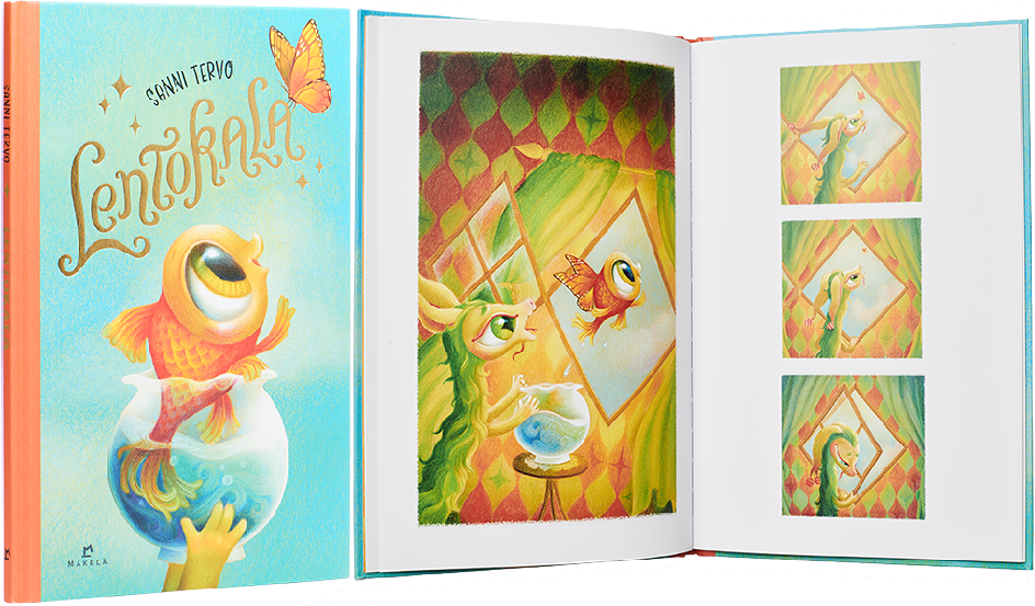
The classic, polished illustrations of Lentokala proceed effortlessly without text. The cover promises a lot: the bookcloth-like material and foiling fit this book perfectly. The wordless story progresses in an interesting way that resembles a comic book, with pictures of varying shapes and sizes. The colour scheme is charming and a bit vintage. The text on the back cover is slightly removed from the style of the rest of the book, looking more like a lead paragraph in a report.
Ida Wikström
Sagan om bokstaven som gick sin väg
- Published by Bookmark
- Graphic design and illustration Ida Wikström
- Reproduced by JK Morris Production
- Printed and bound by Livonia Print
- Paper Geltex 111 Y 115 g/m2, Magno Natural 150 g/m2
- Typeface Futura, Didot
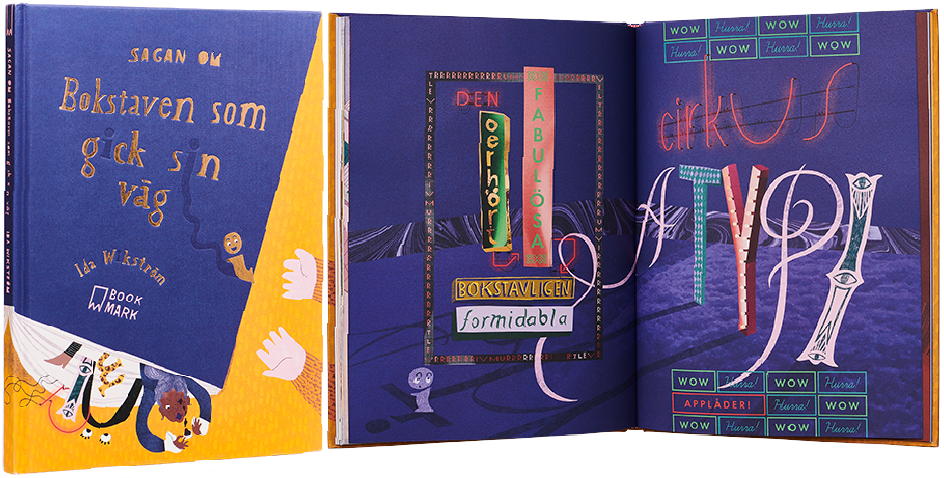
“Writing gives the impression of things. Conversely, things can give the impression of writing.” (Paul Elliman, 1998.) This spirited book is bursting with ideas and moves confidently from one to the next with the breath-taking speed of a fresh mind. Along with the cheerful colour scheme and visual language, the work shows a deep understanding of typography. It forces us to ponder fundamental questions about letters as entities and the relationship between writing and the world.
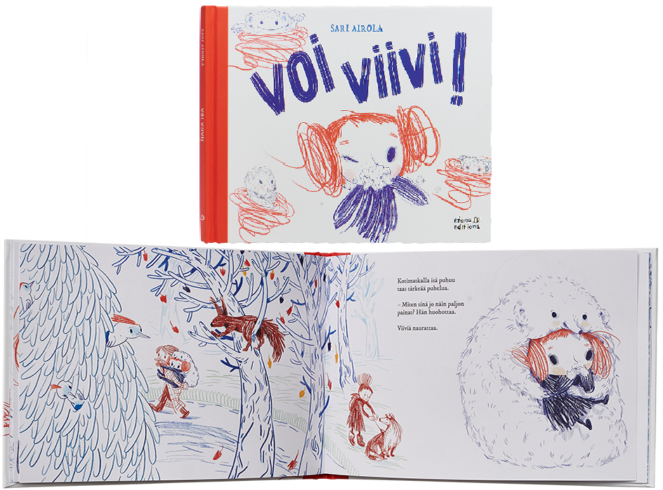
Sari Airola
Voi Viivi!
- Published by Etana Editions
- Graphic design and reproduced by Jenni Erkintalo
- Illustration Sari Airola
- Printed and bound by Jelgavas Tipogrāfija
- Paper Inner pages: Multioffset UPM 150 g, Cover: Galerie Art silk 130 g
- Typeface IM Fell DW Pica Pro
This book is sure to warm your heart. The cover is immediately charming, with its whirlwind liveliness; the vivacious and mischievous coloured pencil line and the use of red and blue as the main colours feel fresh and nostalgic at the same time. The illustrations are tender and funny throughout, the layout arranged with skill. The characters in the book get their expressiveness from extremely small and simple gestures – a style that requires real skill.
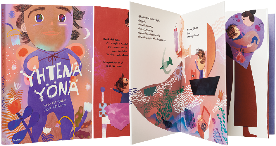
Kaisa Happonen – Satu Kettunen
Yhtenä yönä
- Published by Tammi
- Graphic design Laura Lyytinen, Satu Kettunen
- Cover graphic design and illustration Satu Kettunen
- Reproduced by Keski-Suomen Sivu
- Printed and bound by Leo Paper Group
- Paper C1S artboard
- Typeface Brandon Grotesque
Yhtenä yönä is wrapped stylishly into an accordion. The lively figure of the child on the cover gains strength from how the image is cropped. The three worlds of the story are given rhythm by the use of colour, the folds and the illustration. From the red-violet sleeplessness of the evening, we move through light snow to imagination and finally to sleep. The continuous images and the fold points work, and the back cover closes the book nicely.
