Mia Haltia (Toim.)
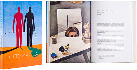
Otto Mäkilä - Punainen levoton kipinä
- Published by Turku Art Museum
- Graphic design Minna Luoma, Candy Graphics
- Reproduced by Timo Lagerström
- Printed by Finepress Oy
- Bound by Saarijärven Offset Oy
- Paper Munken Lynx Rough 150 g/m2, Munken Pure Rough 150 g/m2
- Typeface Gotham
The book on Otto Mäkilä’s modernism has been furnished with a layout respectful of its subject and suitable to its time. The soft, white matt paper is pleasant to read and faithfully reproduces the colours of the paintings. The pared, elegant graphic design is well-considered throughout.
Yanar Hüseyin
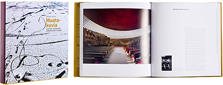
Muotokuvia
- Published by Parvs Publishing
- Graphic design Timo Setälä
- Reproduced by Jussi Tiainen
- Printed and bound by Kariston Kirjapaino Oy
- Paper Galerie Volume 150 g/m2
- Typeface Archer, Klavika
The first impression of the typography is like a whisper or a thoughtful voice heard from the other end of the room. The text’s understandable and refined grip has been achieved through the layout. The book’s aesthetics lay primarily in the balance between the pictures and the columns of text, creating as they do a harmonic whole.
Ulla Jokisalo - Anna Kortelainen (Teksti)
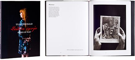
Leikin varjo - Guises of Play
- Published by Musta Taide and Aboa Vetus & Ars Nova
- Graphic design Jorma Hinkka
- Reproduced by Timo Lagerström
- Printed and bound by Kariston Kirjapaino Oy
- Paper Galerie Art Silk 170 g/m2
- Typeface Dalliance Script, Tribute
In the book, the reader is confronted with Ulla Jokisalo’s moving and revealing art credibly structured. Deeply realized pictorial art. The typography never strays from its refined secondary role and with its well-chosen headline font gives a tense unity to the art works. The binding is beautiful and well-considered. The red of the binding paper makes opening the book really impressive.
Minerva Keltanen (Toim.)
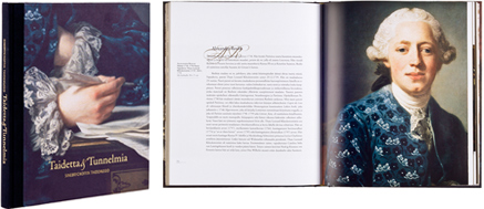
Taidetta ja tunnelmia
- Published by Sinebrychoff Art Museum
- Graphic design Mary-Ann Lindholm
- Printed by Finepress Oy
- Paper Galerie Art Silk 150 g/m2
- Typeface Adobe Garamond Regular, Bircham Script
The book presents 60 works from the Sinebrychoff Museum collection. The difference in size and form together with the bringing out of details give rhythm to the reading experience. Stylish in every way, the layout, with its golden initials, exudes the discrete charm suitable to the spirit of an art work. The faultless general appearance and the gilded page edges emphasize the overall effect.
Laura Köönikkä (Toim.)
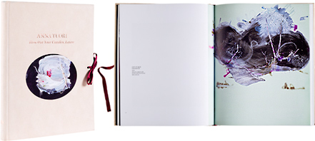
Anna Tuori - Blow Out Your Candles, Laura
- Published by Tampere Art Museum
- Graphic design Liisa Seppo
- Printed and bound by Lönnberg Print
- Paper Galerie Art Matt 170 g/m2, Curious Translucent Clear 112 g/m2
- Typeface Chronicle Text Grade 2, ITC Lubalin Graph
The velvet-soft cover, the binding and the oval-shaped pictures accompany you with style into the distinctive world of Anna Tuori’s paintings. The art work on the inside pages is original and bold, the typography strong – just right for these works. The transparent paper brings an element of its own to the all-encompassing experience.
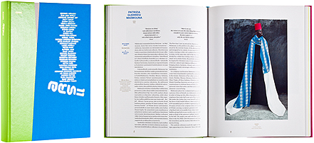
Satu Metsola - Pirkko Siitari - Jari-Pekka Vanhala (Toim.)
ARS 11
- Published by Kiasma Museum of Contemporary Art
- Graphic design Aki Suvanto, Such Design
- Printed by Art-Print Oy
- Paper Galerie Art Silk 150 g/m2, Cyclus Offset 90 g/m2
- Typeface Reader, Mercury HTF
A masterful achievement by the catalogue editors, and above all by the lay-out artist. An easy-to-read and stimulating entity which almost beats a trip to the exhibition. The rhythmically rich pictorial layout and insightful use of colour, respectful to the works and their makers, imaginatively open up to us the world of African art. Convincing proof of the relevance and new possibilities of the catalogue.
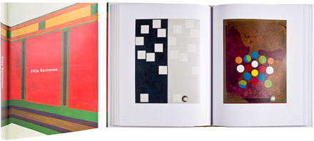
Silja Rantanen
Giotton talo ja muita teoksia
- Published by Sara Hildén Art Museum
- Graphic design Jari Karppanen, Ikonoplus Design
- Printed and reproduced by Libris Oy
- Paper Galleria Art Silk 170 g/m2
- Typeface Titillium
Luxurious paper, careful considered typography and interesting layout as well as magnificent paintings – all the elements of a good art book, with a little extra thrown in: dust sheet opening up into a poster, inside pages opening up into doublesize, refined calico. The experience is guaranteed.

Pirkko Tuukkanen (Toim.)
Pekka Kauhanen - Hurtta, poika ja lum'ukko
- Published by Finnish Art Society
- Graphic design Liisa Seppo
- Printed and bound by Kariston Kirjapaino Oy
- Paper Galerie Art Matt 170 g/m2, Curious Metallics
- Typeface Utopia, Soho, Paggio
A departure from the general festifity of the art book which brilliantly tries to come to terms with Kauhanen’s sculpted figures. Daring layout solutions and comparisons. The typography is almost experimental, at least a renewal of the genre, and to crown it all the gold and the silver which has not been used sparingly. An art book for our times executed with skill, in festive attire.
