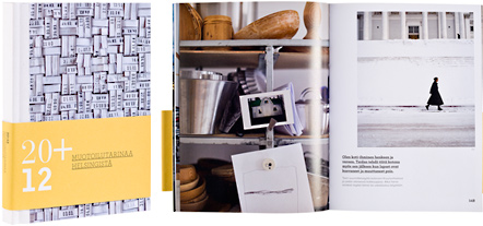
Katja Hagelstam - Piëtke Visser - Eva Lamppu
20 + 12 muotoilutarinaa Helsingistä
- Published by WSOY
- Graphic design
- Piëtke Visser
- Photography Katja Hagelstam
- Reproduced by Aste Kirjat Oy
- Printed and bound by Kariston Kirjapaino Oy
- Paper Arctic the Matt 150 g/m2
- Typeface Archer, Proxima Nova Alt, Bell Gothic Std, Bauer Bodoni Std 1
Interesting picture angles, modern typography and pleasant paper create a totality which is a delight to browse. These stories are cozy and interesting. The exciting binding and inventive frontispiece give direction to the stories: not worshiping iconic form but personal, touching – and so today.
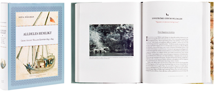
Sofia Häggman
Alldeles hemlikt - Georg August Wallins Egypten 1843-1845
- Published by The Society of Swedish Literature in Finland
- Graphic design Camilla Pentti
- Reproduced by Kari Lahtinen
- Printed by Oy Painotalo tt-urex Ab
- Bound by Finnreklama Oy
- Paper Scandia Smooth 115 g/m2
- Typeface Bodoni Twelve, Bodoni Egyptian Pro
A book about G. A. Wallin’s expeditions to Egypt has been given an elegant design. The work’s wide-ranging material is well controlled and the illustrations skillful. The printing quality can only be admired. The colour range is harmonious, the paper pleasant and the typography subtle. The opening passages of each chapter are carefully constructed works of art.
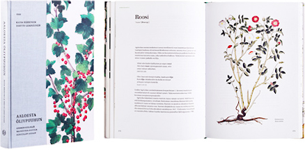
Kaisa Häkkinen - Terttu Lempiäinen
Aaloesta öljypuuhun - suomen kielellä mainittuja kasveja Agricolan aikaan
- Published by Kustannusosakeyhtiö Teos
- Graphic design Dog Design
- Reproduced by Keski-Suomen Sivu
- Printed and bound by Bookwell Oy
- Paper Munken Lynx 120 g/m2
- Typeface Utopia Std
Perfect graphic design for a non-fiction work. The chapter opening spreads are beautiful and bring the age of Agricola handsomely into the present. The additional colour of the refined typography gives structure to the text and is well-suited to the illustrations. The binding is faultless, the red-current of cover and binding paper makes one yearn for an autumn garden.
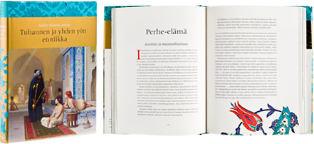
Jaakko Hämeen-Anttila
Tuhannen ja yhden yön erotiikka
- Published by Otava Publishing Company Ltd.
- Graphic design Päivi Puustinen
- Reproduced by Aste Kirjat Oy
- Printed and bound by Otava Book Printing Ltd.
- Paper Scandia 2000 Ivory 115 g/m2
- Typeface Meridien LT Std
For many reasons an alluring book. The cover elements are made up of a harem bathhouse, classical typography as well as gilding and decoration. These elements, together with the beautiful typography, have brought about a clear and easy-to-read book. Seductive, erotic decorativeness and occasionally powerful colours to heighten the illustrations have been used to create the concept. Distinguishing certain stories from the text proper has been accomplished elegantly and with versatility.
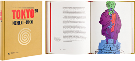
Iida Turpeinen - Jaakko Uoti (Toim.)
TOKYO 50 - Taideteollisen korkeakoulun opiskelijaliike
- Published by Aalto University School of Art and Design
- Graphic design and illustration Antti Kyrö
- Printed by Otava Book Printing Ltd.
- Paper Scandia 2000 Ivory 115 g/m2, Scandia 2000 Smooth Natural 150 g/m2
- Typeface Bembo Book MT Pro, Auto 1 Black Sm Cp, Garage Gothic FB Black
Despite using difficult material the book has successfully compiled a history of the University of Industrial Arts student movement. The book’s substantial and sprawling pictorial world expressed with Arto Kyrö’s drawings gather together Tokyo’s 50 years into a living entity, which will attract others than interested parties.
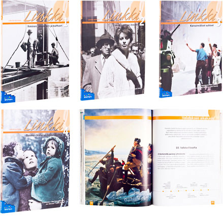
Juhana Aunesluoma - Anu Lahtinen - Ulla Lehtonen - Titta Putus-Hilasvuori - Erika Ripatti - Jouni Similä - Jari Ukkonen - Laura Vuorela
Linkki 1-4:
Ihminen, ympäristö ja kulttuuri
Eurooppalainen ihminen
Kansainväliset suhteet
Suomen historian käännekohtia
- Published by Sanoma Pro Oy
- Photo editor Kati Koivikko
- Graphic design Anu Törmä, Jenni Törmä
- Reproduced by Ilkka Ärrälä
- Printed and bound by Bookwell Oy
- Paper HighSpeed Matt 80 g/m2
- Typeface Adobe Garamond Pro, News Gothic Std
The typography of this series of textbooks is deserving of applause, and will lead the secondary school student to be inspired by and interested in history and the environment. The pictorial narrative forms a totality of its own, but at the same time it brings the text to life with its sometimes startling descriptive approach.
