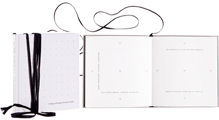
Mikael Brygger - Henriikka Tavi - IC-98
Tekstinauhoja - In large, well-organized termite colonies
- Published by Iconoclast Publications, Poesia
- Graphic design Patrik Söderlund
- Printed by Aldus Oy
- Bound by Esko Salonen, Master Bookbinder
- Paper Scandia 2000 Natural 115 g/m2
- Typeface Adobe Garamond Premier Pro, Courier New
With its long bookmark this challenging book is also a beautiful object. The text, in two languages, is placed on the pages like a riddle and leads the reader on a trip out of a labyrinth. The cover’s embossed column hollows are a touching insight.
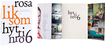
Rosa Liksom
Hytti nro 6
- Published by WSOY
- Graphic design Martti Ruokonen
- Printed and bound by Kariston Kirjapaino Oy
- Paper Hollmen Book 1.8 70 g/m2
- Typeface Adobe Jenson Pro
As well as a fluent reading experience, Rosa Liksom’s Cabin no. 6 is easy on the eye, a book which is suitable to hold and which fits easily into a handbag. The harmonious format and skillfully chosen typography are freshly modern. The picture compilation on the overlapping inner covers open up a window to the Soviet period – illustrating the atmosphere rather than the text.
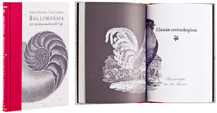
Hilkka Olkinuora - Torsti Lehtinen
Sallimuksia
- Published by WSOY
- Graphic design Marjaana Virta
- Printed, bound and reproduced by Bookwell Oy
- Paper Munken Lynx 100 g/m2
- Typeface Garamond
Destinies is a book to be browsed through on whose every page you will find what you are looking for. You can grab it from your bookshelf and give it to a friend. Or shove it in the pocket of your duffle coat, read a few lines, lightly stroke the rough calico spine, open, close. Continue later.
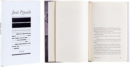
Joni Pyysalo
Ja muita novelleja
- Published by WSOY
- Graphic design and illustration Jussi Karjalainen
- Printed and bound by Bookwell Oy
- Paper Ensocreamy 70 g/m2
- Typeface Adobe Garamond
The name on the cover and the unfinished affect of the contents is stylishly visualized. The use of black and white, thick strickethroughs and plain typography is effective. The walruses spurting from underneath the dustjacket are a more than enjoyable surprise. The controlled and well considered visualization continues in the typography inside.
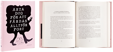
Philip Teir
Akta dig för att färdas alltför fort
- Published by Söderströms
- Graphic design Hanna Lahdenperä
- Cover design Sanna Mander
- Printed, bound and reproduced by Oy Nord Print Ab
- Paper Lux Cream 80 g/m2
- Typeface Kepler Light, Kepler Regular
The pleasant dustjacket, intriguing cover, suprising front page – you feel obliged to open the book – and then the calm body text, bright classical double page spreads, careful typesetting, progress naturally… Did it say anything? Yes it did, read it for yourself.
