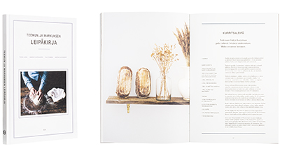
Teemu Aura - Markus Hurskainen - Pia Sievinen - Anton Sucksdorff
Teemun ja Markuksen leipäkirja
- Published by Teos Publishers
- Graphic design Hennamari Asunta
- Photography Anton Sucksdorff
- Reproduced by Keski-Suomen Sivu Oy
- Printed and bound by Bookwell Oy
- Paper Munken Lynx 150g/m2
- Typeface Apercu Pro, Fortescue Pro
Is it all right to immerse your hands in dough yet? Smell of fresh bread, craftsmanship and unhurried moments fill this book. Illustrations are extraordinarily sensuous, both paper and cover cardboard right kind of grainy. Even the binding is restful and of high quality. Lovely entity suited to its time, with more polished typography this could be just perfect.
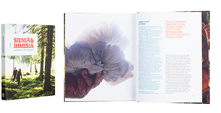
Saimi Hoyer - Petri Salmela
Sieniä & ihmisiä
- Published by Tammi Publishers
- Graphic design and photography Petri Salmela
- Reproduced by Keski-Suomen Sivu Oy
- Printed and bound by Livonia Print
- Paper Amber Graphic 140g/m2
- Typeface Caecilia LT Std
In Finland’s first mushroom-lifestyle-book the ochres, mauves and purples of the fungi radiate along the forest greens. Plethora of pictorial is supported with fresh, unpretentious typography, as varied as a forest path. Colours of the typeset come from a bright palette, emphasizing the muted colours of the mushrooms. The book positively oozes passion towards the fungi, and invites on an expedition into the enchanting world of mushrooms.
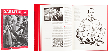
Ville Hänninen - Jussi Karjalainen
Sarjatulta! Sota-ajan suomalaiset pilapiirrokset ja sarjakuvat
- Published by Kustannus Jalava
- Graphic design Petri Latvala
- Printed and bound by Livonia Print
- Paper Munken Print Cream 100g/m21.5
- Typeface Relay, Miller
Red is the colour of this book, symbolising the topic and acting as an emphasizer in layout. The selected material and format are pleasing. Soft and shaded paper of the inside helps to tie together the challenging picture material. Pictorial and narrative contents are splendidly separated by means of typography.
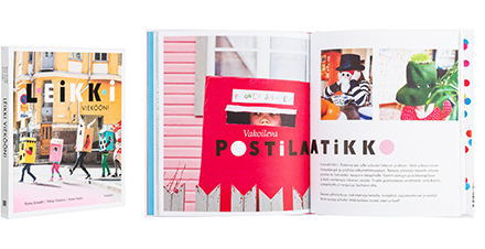
Kaisa Järnefelt - Meiju Niskala - Anne Vasko
Leikki vieköön!
- Published by Tammi Publishers
- Graphic design Laura Lyytinen
- Illustration Anne Vasko
- Reproduced by Keski-Suomen Sivu Oy
- Printed and bound by Livonia Print
- Paper Amber Graphic 130 g/m2, Amber Graphic 140 g/m2
- Typeface Futura Std, ATAdminister, NeuzeitS, Twentieth Century MT, Bubblegum, Bauhaus93
Charmingly rebellious book. Pictures, illustrations and crafted letters will drag anyone in the play. Photos from various sources act in unison, and their descriptions are a work of great fun. Crazy action that survives happily even the slightly stiff typography. The form fits the hand nicely.
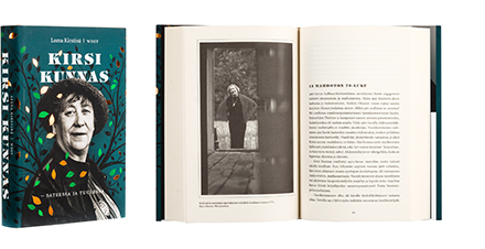
Leena Kirstinä
Kirsi Kunnas - sateessa ja tuulessa
- Published by WSOY
- Graphic design Jussi Karjalainen
- Printed and bound by Bookwell Oy
- Paper Ensolux Cream
- Typeface Minion Pro
The colour scheme of the cover with all the beauty of the autumn calls for reading, as does the inventive title and chapter typeface, characteristic to the author. Shades of green and copper browns dance serenely. Meticulous design leads all the way to the mini-poster of the author’s works that can be found inside the dustjacket.
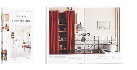
Hanni Koroma - Sami Sykkö - Jaanis Kerkis
Avaimia ajattomiin suomalaisiin sisustuksiin
- Published by Gummerus Kustannus Oy
- Graphic design Hennamari Asunta
- Photography Jaanis Kerkis
- Printed and bound by Jelgava Printing House
- Paper Munken Lynx 150g/m2
- Typeface MrsEaves
However unlikely format for a book on Interior Design, the result is effortless, brisk and fresh. Layout is lively and contents in bite-sized bits, inviting to browse. Dazzling pictures have received the printform they deserve. This sympathetic book succeeds in avoiding the clinical, which is hindering so many other books of the genre. These are the homes one wants to live in!
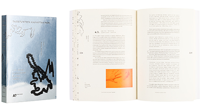
Alma Muukka-Marjovuo
Taidetunteen kasvattaminen
- Lilli Törnudd taidekasvatuksen maailmoja luomassa
- Published by Aalto University / Aalto ARTS Books
- Printed and bound by Unigrafia Oy
- Graphic design Milena Huhta
- Paper Chromolux Alu/Magic 250g/m2, Munken Lynx 120g/m2, Munken Print Cream 115g/m2
- Typeface Mignon (Helsinki Type Studio), Ondine, Letter Gothic
Turning demanding material into something beautiful and streamlined is evidence of the designer’s skill. Well pre-planned base for layout enables exciting variety in columns, and the different parts of research are cleverly separated through the use of a variety of colours in paper. Small ornamental illustrations bring an interesting extra to scientific text.
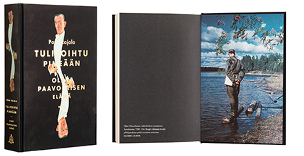
Panu Rajala
Tulisoihtu pimeään
- Olavi Paavolaisen elämä
- Published by WSOY
- Graphic design Martti Ruokonen
- Printed and bound by Bookwell Oy
- Paper Ensolux cream
- Typeface Minion Pro
Outward appearance of the book is puzzling. The cover carries an image of the author, mirrored to create a sort of a monogram. Soft black shading of the flyleaf matches the atmosphere perfectly. Fashionable velvet laminate feels for once a well-grounded choice. Straight spine of the book enhances the straight character of the cover.
