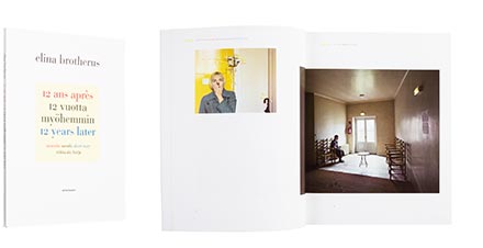
Elina Brotherus - Riikka Ala-Harja
12 ans après / 12 vuotta myöhemmin /
12 Years Later
- Published by Sémiosquare
- Graphic design Jorma Hinkka / Graafiset Neliöt Oy
- Photography Elina Brotherus
- Reproduced by Petri Kuokka / Aarnipaja Ky
- Printed by Libris Oy
- Bound by Finnreklama Oy
- Paper Mohawk Loop Feltmark White 298g/m2, Galerie Art Silk 170g/m2
- Typeface Bauer Bodoni, Filosofia
Classic choice in typeface and the colours of the outward appearance illustrate inventively the world of this book on photography. A large size and a refined dustjacket protect the esteemed bookishness in a format that’s in other aspects slightly reminiscent of newsprint. The short story section is well separated from the photos with yellow matte paper.
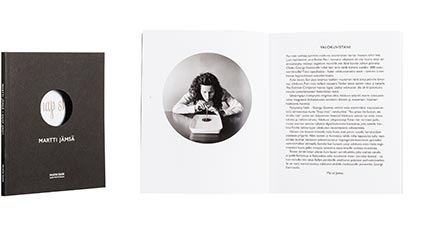
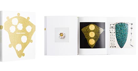
Martti Jämsä
Snap Shot
- Published by Aalto ARTS Books / Musta Taide
- Graphic design Jorma Hinkka / Graafiset Neliöt Oy
- Reproduced by Tuomo-Juhani Vuorenmaa
- Printed by Libris OyReproduced by Tuomo-Juhani Vuorenmaa
- Bound by Finnreklama Oy
- Paper Rainbow black 230g/m2, Galerie Art Silk 150g/m2
- Typeface Liza, Gill Sans
A small format book, with simplistic bind and monotony in layout are good choices when presenting a picture series impressed by round snap-shot photography of the 1800’s. Matte-black cover with its silverfoil printed typography come out as obvious choices, reserving the mainstage to the pictures themselves. The overall effect is almost meditative.
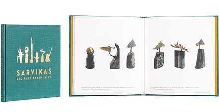
Ilja Karsikas (Toim./Ed.) - Helena Karsikas - Janne Kauppinen - Seppo Turunen
Sarvikas - Leo Karsikkaan taide
- Published by Ilja Karsikas
- Graphic design Ilja Karsikas
- Reproduced by Jani Mahkonen / Loma Graphics, Ilja Karsikas
- Printed and bound by Saarijärven Offset Oy
- Paper Munken Lynx 130 g/m2
- Typeface Dante MT, Futura, Mostra Nuova
This book of art is best described as sympathetic and cosy. The shades of cover in calico and foil reveal immediately one of the artist’s materials: the bronze. Decades of pictures are successfully combined into a well-balanced book, which is a pleasure to read.
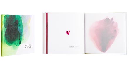
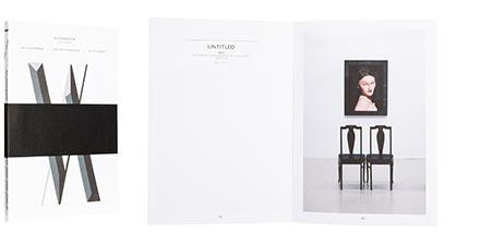
Melek Mazici
Melek Mazici Transparency
- Published by Parvs Publishing
- Graphic design Mirka Kolehmainen
- Printed and bound by Bookwell Oy
- Paper Arctic Volume 150g/m2
- Typeface Parisine, Chronicle
Book like the silence, with nothing in excess. Print-wisely demanding works of light and surface reproduce surprisingly well, conveying their ethereal nature without pressure. Empty space breathes, everything is in moderation. For once we have a book where translucent paper could have been used in even larger quantities.
Sarianne Soikkonen (Toim./Ed.) - Hanna Johansson - Timo Valjakka
Marika Mäkelä
- Published by Sara Hildén Art Museum
- Graphic design Jari Karppanen / Ikono+Design
- Printed by Erweko Oy
- Bound by Finnreklama Oy
- Paper Galerie Art Silk 170g/m2, Rives Tradition Bright White 170g/m2
- Typeface Kana Sans (Takaaki Goto)
This luxurious book on art competed on the title of the most beautiful book of the year right to the finishing line, gaining silver with a brilliant effort. Meritable layout, special folio, dustjacket opening into a poster, cloth binding and other treats serve a purpose. The paintings are reproduced to the maximum limit of printing technology. Gleaming spot lacquer overprints bring a novel, surprising and elegant level on the paintings.
Juha-Heikki Tihinen (Toim./Ed.) - Ville Andersson
Mitt lilla imperium
- Published by The Pro Artibus Foundation
- Graphic design Chris Bolton
- Reproduced by Ville Andersson
- Printed and bound by Tallinna Raamatutrükikoja Oü
- Paper Scandia 2000 White 150g/m2
- Typeface Gill Sans
Minimalistic and polished work stripped of all excess all the way to the cover. The layout is laconic, leaving room for the artist’s works. Modern appearance bides well with the young artist’s world, only the theme of the cover woke a question among the jury, whether it was in line as a part of the whole. Pressing the titles of individual pieces of art is a rare solution, here well justified.
