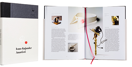
Eija Aarnio (Toim.)
Ismo Kajander: Anartisti
- Published by Finnish National Gallery / Museum of Contemporary Art Kiasma
- Graphic design Ilkka Kärkkäinen
- Photography Ismo Kajander
- Printed, reproduced and bound by Aldus Oy
- Paper Gallerie Art Volume 150g, Munken Print 115g
- Typeface ITC Casion, Berthold Future, Chronicle Text
Oh, the joy in layout! Spreads flow effortlessly and the layout repeats the major musical scale of the works themselves. Rarely can one see such a masterful embedding. Timeless, fresh and exciting! If only the “anartism” extended to the covers, this would be a bulls-eye.
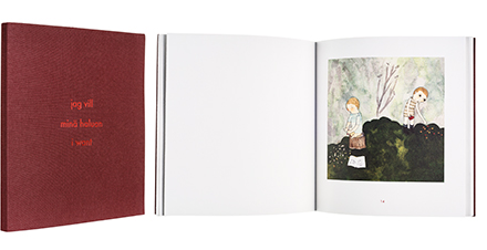
Malin Ahlsved - Leevi Haapala
Jag vill / Minä haluan / I want
- Published by The Pro Artibus Foundation
- Graphic design Piëtke Visser
- Printed and bound by Sindruk
- Paper Conqueror Connoisseur soft white 160 g/m2
- Typeface Futura
Beautifully printed watercolours in a well-considered package. The red in this literary object is not christmassy or romantic, but the raw flesh of life, ever present in the macabre works of the artist. There is a sense of hidden secrets both in embossed cover and the pastel echoes oozing from the binding.
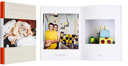
Maarit Hohteri - Ilkka Karisto
Between Us - Ystäväkirja
- Published by Aalto ARTS Books, Musta taide
- Graphic design Otto Donner
- Photography Maarit Hohteri
- Reproduced by Petri Kuokka / Aarnipaja Ky
- Printed and bound by Kopa
- Paper Arctic Volume 150 g/m2, Colorit 100 g/m2
- Typeface Apercu
Belly band that’s become so popular last few years is often unnecessary, but on this book of Hohteri’s photos it’s an additional temptation just as the red spine of the book. Coloured recto and verso pages lead to a well-placed pictorial of everyday moments. Quality paper and print fulfill the entity. One of The art books of the year.
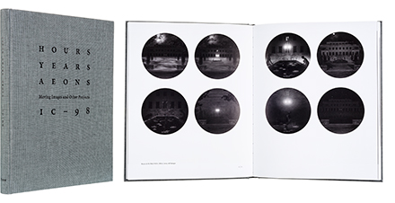
IC-98
Hours, Years, Aeons: Moving Images and Other Projects 1998-2015
- Published by Frame Visual Art Finland
- Graphic design Minna Luoma / Candy Graphics, Patrik Söderlund / IC-98
- Illustration IC-98
- Reproduced by Petri Kuokka / Aarnipaja Ky
- Printed by Lönnberg Painot Oy
- Bound by Finnreklama Oy
- Paper Galerie Art Volume 170 g/m2, Edixion Offset 170 g/m2
- Typeface Minion Pro
This grayscale book is a restful passepartout to the language of art, and succeeds wonderfully to present the creative works of this video artist duo. Layout works strict and orderly and creates a dialogue with the photos. Pictorial material supports every project on their own terms.
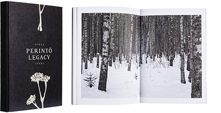
Tekla Inari
Perintö - Legacy
- Published by Aalto ARTS Books, Musta taide
- Graphic design Jaakko Suomalainen, Tekla Inari
- Illustration Miina Pohjolainen
- Photography Tekla Inari
- Reproduced by Petri Kuokka / Aarnipaja Ky
- Printed and bound by Lönnberg Painot Oy
- Paper Scandia 2000 130 g/m2
- Typeface Legacy, Pargas Sans
Sensitive but stern collage of photographs and verse uses small means to explain the post-traumatic stress of war. The story becomes one with the design, unassuming and impressive. Bare cover and dark edges of the pages create an object not unlike a piece of tarred wood. The result is at the same time monolithic and intimate.
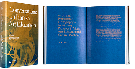
Mira Kallio-Tavin - Jouko Pullinen (Toim.)
Conversations on Finnish Art Education
- Published by Aalto ARTS Books
- Graphic design Safa Hovinen
- Printed and bound by Saarijärven Offset Oy
- Paper Munken Lynx 120 g/m2
- Typeface Warnock, Oligark
This is a book meticulously made, loving the materials. Typography, colour scheme and unique serigraphy concept cover sing their praise towards both the book form and the knowledge within. Secondary blue colour in the typeset is a brave choice in this genre, and it succeeds. Calm and confident layout encases a wide variety of illustration without a question.
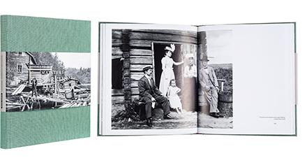
Marko Karo - Anja Portin
Maisteri Starkin arkisto
- Published by Aalto ARTS Books, Musta taide
- Graphic design Minna Luoma / Candy Graphics
- Reproduced by Jarkko Sopanen / Chromatic Print Studio
- Printed by Lönnberg Print & Promo
- Bound by Finnreklama Oy
- Paper Multiart Silk 170 g/m2, Munken Pure 80 g/m2
- Typeface Adobe Jenson Pro
Mulitalented Matias Alfred Stark built himself a camera that he then used to document people and the countryside, both for his own pleasure as well as postcards and exhibitions. The combination of photographs, cards and written word is enchanting. Multi-faceted yet controlled entity invites to voraciously enjoy the spreads. This is a true reminder that content, visual effect and elements of surprise are not excluding one another.
Tapani Pennanen - Marjut Villanueva (Toim./Ed.)
Ville Andersson - Vuoden nuori taiteilija 2015
- Published by Tampere Art Museum, Aboa Vetus & Ars Nova
- Graphic design Ahonen & Lamberg
- Photography Ville Andersson
- Printed and reproduced by Aldus Oy
- Bound by Esko Salonen / Mestarinkirja
- Paper Galerie Art Volume 1.1 150 g/m2, Edixion offset 100 g/m2
- Typeface Times New Roman
Book like a sculpture: massive, clear and unfaltering. Unsaturated world of the artworks can breathe deep on the wide spreads. Strict and basic typography does not draw attention, the reader returns over and over again to the lines and folds of the works on the white pages. A magnificent cover forms a perfect casing for the content.
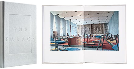
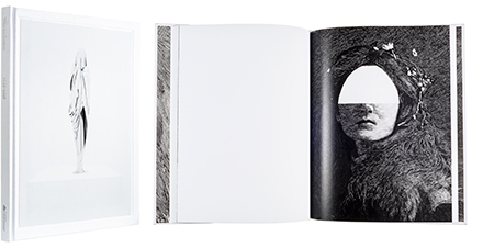
Salla Tykkä - Maija Timonen - Michele Friend - Tatiana M. Holway
The Palace
- Published by Galerie Anhava
- Graphic design Hennamari Asunta
- Reproduced by Petri Kuokka / Aarnipaja Ky
- Printed and bound by Lönnberg Painot Oy
- Paper Munken Lynx Rough, Geltex LS
- Typeface Century Gothic, Berling
Ingenious combination of Soviet nostalgia and modern choices in material. The opacity of paper rewards the layout while the binding supports full spread images. Language of the video is similar to the design and pictorial quality and the subtle charm in writing supports the entity. Blonde and unpretentious book rewards the reader with juicy fruits.
