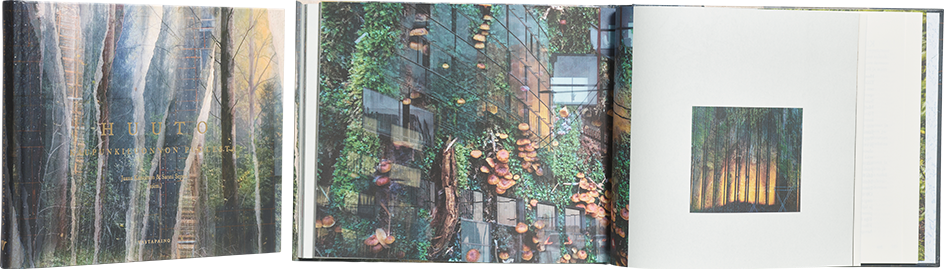
Jaana Kanninen – Sanni Seppo (eds.)
Huuto kaupunkiluonnon puolesta
- Published by Vastapaino
- Graphic design Mirkka Hietanen, Sanni Seppo
- Illustration Siiri Hänninen, Seela Pentikäinen
- Photography Sanni Seppo
- Reproduced by Petri Kuokka / Aarnipaja
- Printed and bound by Tallinna Raamatutrükikoda
- Paper Munken Premiun Cream 100 g/m²
- Typeface Adobe Caslon Pro
A necessary cry of alarm on behalf of urban nature has been given a restrained and serious but artistic form. Powerful, aesthetically controlled images rise from the calm layout to communicate the distress of urban nature. The delicately drawn endpapers, complete with a map pocket, contribute a charming humanity, and small plant vignettes accompany the reader as one journeys through the text. The horizontal format of th book works beautifully, embodying the landscape. An occasional datedness slightly detracts from the book’s depiction of the contemporary city.
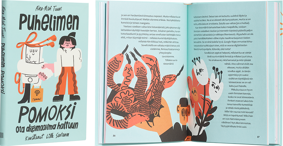
Aino-Mari Tuuri – Lille Santanen
Puhelimen pomoksi. Ota digimaailma haltuun
- Published by Tammi
- Graphic design and illustration Lille Santanen
- Reproduced by Keski-Suomen Sivu Oy
- Printed and bound by BALTO print
- Paper Maestro Print 120 g/m2
- Typeface Minion Pro, Candara, Metallophile Sp8
This book about the addictiveness of the digital world has been illustrated and coloured in a nostalgic ’50s style. The contrast between flashy digital aesthetics and the book’s humorous illustrations works like pedals on a bicycle, and the limited colour scheme was an excellent choice. Pull quotes delight the reader throughout this children’s nonfiction book, which has appeal for all ages.
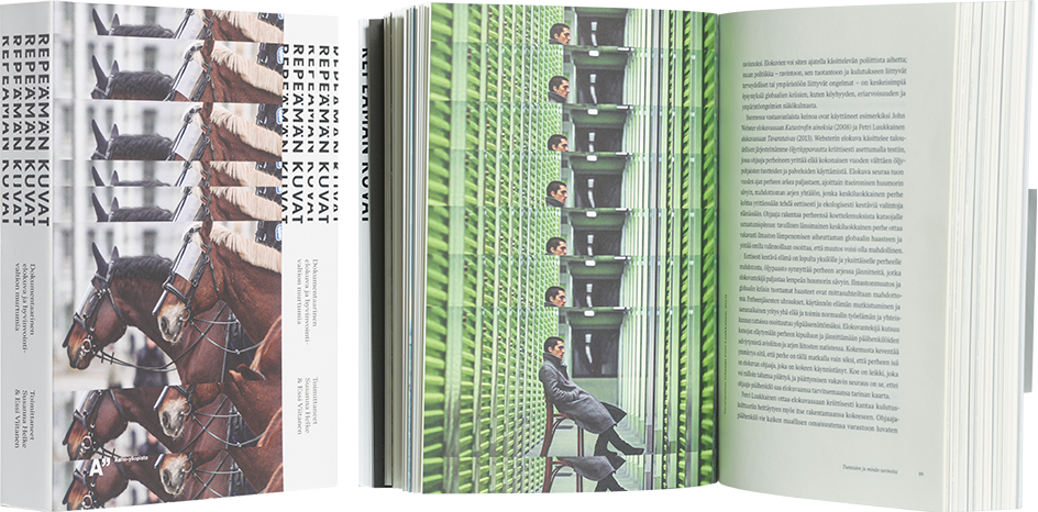
Susanna Helke – Essi Viitanen (eds.)
Repeämän kuvat - Dokumentaarinen elokuva ja hyvinvointivaltion murtumia
- Published by Aalto ARTS Books
- Graphic design Anna-Mari Tenhunen
- Reproduced by Petri Kuokka / Aarnipaja
- Printed and bound by PunaMusta
- Paper Munken Lynx 300g/m², Scandia 2000 Ivory 115 g/m
- Typeface Ivar Text, Neue Montreal, Nobel
Only a true professional can find a book’s rhythm and knows how to create a cover that is not only powerful and appropriate to the topic, but also minimalist. The size, scope and print quality of this work are pleasing to the eye and hands. The cinematic use of images is a wonderful, impactful effect that carries throughout the book. An excellent graphic work that understands its subject.
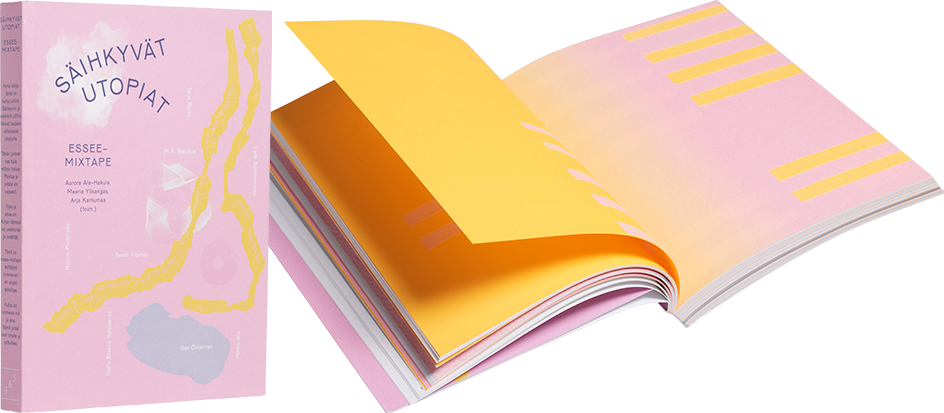
Aurora Ala-Hakula – Arja Karhumaa – Maaria Ylikangas (eds.)
Säihkyvät utopiat – essee-mixtape
- Published by Kustantamo S&S
- Graphic design and illustration Arja Karhumaa
- Printed and bound by Jelgavas Tipogrāfija
- Paper Munken Lynx 100 g/m2 ja 240 g/m
- Typeface Pirelli, Agentur, Avara, Giddyup, Alright Sans, Arial, Zangezi, Arnhem, Neue Haas Grotesk, Halyard, Nobel, Joseleen, Helvetica, Mr Darcy, GT Alpina, ITC Goudy Sans
This seemingly delicate softcover book contains an invigorating anarchy that challenges the book’s form: the back text is on the spine, the pages between chapters go on for three spreads, on which the text fades away into pinkness, the table of contents is not a list but a carefully considered bunch, floating in air. The pink and marigold orange glow and set each other aglow. Instead of representational images, cloud-like forms leave plenty of room for interpretation and atmosphere. The diverse typography, making use of sixteen different fonts, is inspiring and an interesting way to set the different texts apart as their own entities.
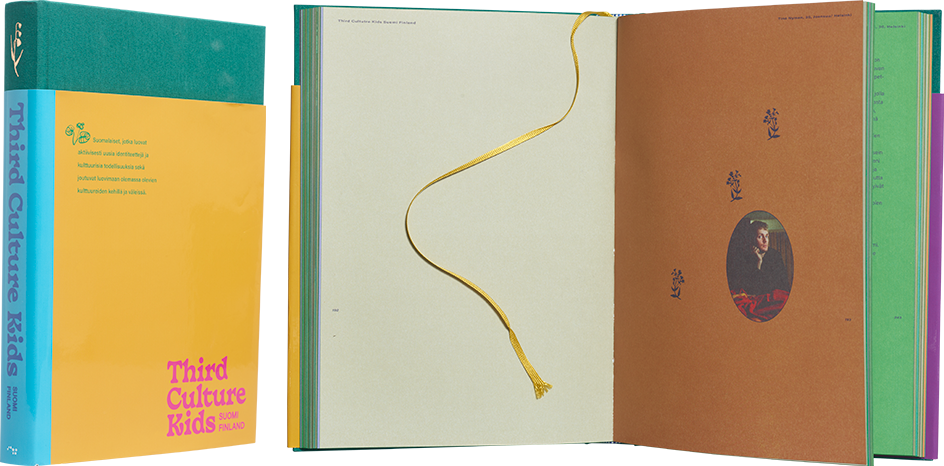
Mona Eid – Koko Hubara (eds.)
Third Culture Kids
- Published by Otava Publishing Company
- Graphic design and illustration Kiia Beilinson
- Photography Caroline Suinner
- Reproduced by Aste Kirjat
- Printed and bound by Otavan Kirjapaino
- Paper UPM Fine 140 g/m2
- Typeface Biblon Pro, Basteleur, Geeza Pro, Acumin Variable Concept, Raanana
Sometimes more is more. The colours of this weighty book glow on its cover, endpapers, interior, and edgepainted pages. The materials have been invested in, and the layout is generous and clear. The profusion of details emphasises abundance: the shiny band on the cover, the gold embossing on the cloth cover, the ribbon bookmark, the flowers fluttering on the pages, the plentiful colours and the variety of image formats.
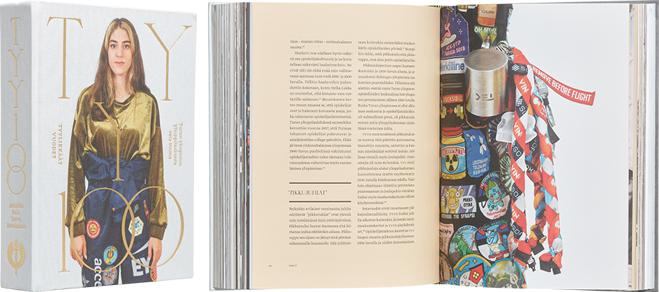
Topi Artukka – Liisa Lalu – Otto Latva – Panu Savolainen
Tyylikkäät vuodet – Turun yliopiston ylioppilaskunta 100 vuotta
- Published by The Student Union of the University of Turku
- Graphic design Anna-Mari Tenhunen
- Photography Anna Autio
- Reproduced by Petri Kuokka / Aarnipaja
- Printed and bound by Oddi Sales / GPS Group
- Paper Munken Lynx 130 g/m²
- Typeface Chloé, Greta Text Pro, Neue Montreal
Hats off to this book’s excellent image editing and repro work – the book, which contains mainly a variety of historical images, is a real masterwork of image editing. The book draws you in, the images invite you to explore, and as a whole, the work comes to life on the paper. The choice of materials for the visually restrained cover is attractive, and the layout of the interior is practical and unfussy. The size of the book is a problem, however. The cover and binding are unable to support the massive number of pages.
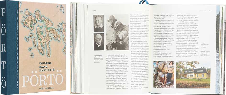
Gun Ahlfors – Curt-Olof Eklund – Henry Mansner – Christian Westerback
Vandring bland släktled på Pörtö under tre sekler
- Published by EW Finland
- Graphic design Tuija Tarkiainen
- Other designer and photography Christian Westerback
- Reproduced by Asko Rokala
- Printed and bound by Jelgavas Tipogrāfija
- Paper Munken Pure 120 g/m²
- Typeface Schotis Display & Text, Funkis
A classic approach has been taken in designing the exterior of this work. While the cover is not particularly interesting, once you start browsing the book, you find yourself captivated. The layout and typography are harmonious, avoiding unnecessary gimmicks. The images have been nicely brought into line, and the choice of paper brings a glow and warmth to the work. The beautiful spine is a delightful detail; instead of squeezing in information, it has been dedicated to beautiful letters. The timeless result, designed by a skilled professional, is clearly exceptional among local histories.
