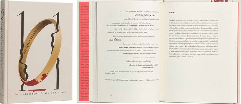
Laura Lindstedt – Sinikka Vuola
101 tapaa tappaa aviomies. Menetelmällinen murhamysteeri
- Published by Siltala Publishing
- Graphic design M. Kinnunen
- Printed and bound by Pakett
- Paper Holmen Book Cream 70 g/m²
- Typerface Granjon LT Std, Medusa, Mercury Text G2, Mrs Eaves Mod OT
The cover illustration, spot varnishing and dynamic composition with the typography are successful both artistically and in terms of marketing: the book attracts attention and stands out. The endpapers invite extended examination. The playful typography brings a narrative level to the portrayal of emotions and characters, and mismatched fonts create variation in tone and delight the reader. The method is not overused, however, and there is also the opportunity to relax into the story. All in all, a professional piece of work, a polished and precisely executed whole.
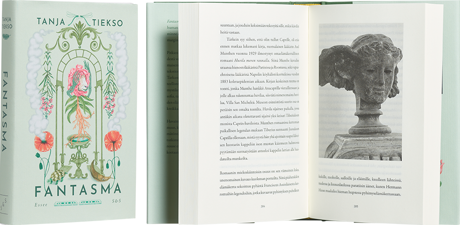
Tanja Tiekso
Fantasma
- Published by Kustantamo S&S
- Graphic design Pauliina Mäkelä
- Layout Jukka Iivarinen
- Photography Tanja Tiekso, Saara Kauppinen
- Printed and bound by Livonia Print
- Paper Munken Premium Cream 15
- Typerface Garamond Premier Pro
This essay on the history of connections between species has been given a tranquil and elegant cover, its absurdity wonderfully
and sneakily revealing itself upon closer examination. The delicate greenish colour of the cover is calm and sets the scene for the skilful image, while the gold foiled text and vignette images add gravity. The green of the clothbound covers continues stylishly onto the endpapers. The illustrations and text of the interior pages progress smoothly without any surprises.
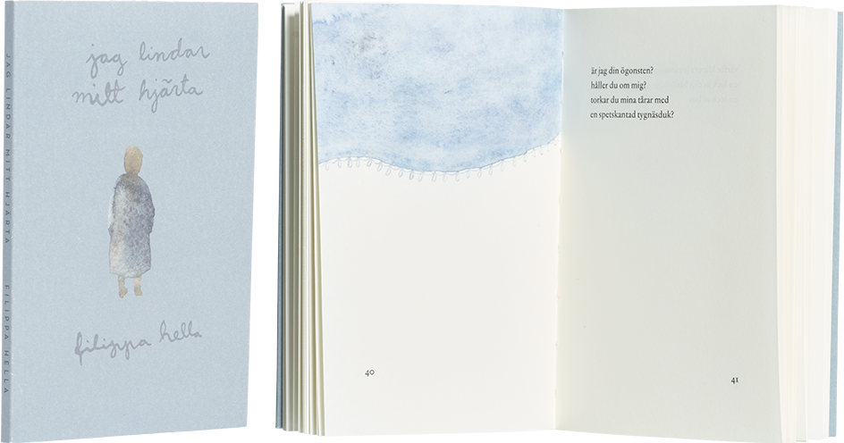
Filippa Hella
jag lindar mitt hjärta
- Published by Boklund Publishing
- Graphic design Christoffer Leka
- Illustration Filippa Hella
- Printed and bound by Ecoprint
- Paper Munken Pure 90 g/m2, Munken Pure Rough 300 g/m2
- Typerface Jannon Text
The delicate appearance of this understated book of poetry is at one with its heartrending subject. The muted cover, the curtain of tears on the inside covers, and the transparent watercolour vignettes transport the reader into the melancholy of the contemplative narration. The layout’s successful rhythm and careful planning gives space for the mood
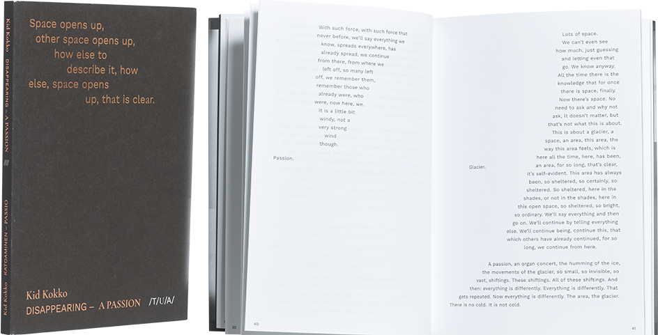
Kid Kokko
Katoaminen – passio
- Published by Teatterin Uusi Alkukirjasto
- Graphic design Arja Karhumaa
- Other designer Kid Kokko, Aino Nieminen
- Printed and bound by Jelgavas Tipogrāfija
- Paper Munken Kristall 100 g/m2, 240 g/m2
- Typerface Work Sans, Cormorant Garamon
Katoaminen’s restrained cover comes to life when the book is tilted, and the placement of the copper foiled text fits the idea of disappearing. The book’s flip effect is confusing at first – the work requires patience, but it pays off. The typography and layout are simultaneously refined and powerful. The visual whole is poetic, and many pages are graphic art. On grey pages, the letters disappear and readability suffers, but it’s presumably intentional.
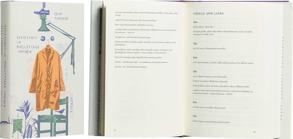
Eeva Turunen
Sivistynyt ja miellyttävä ihminen
- Published by Siltala Publishing
- Graphic design Jussi Karjalainen
- Printed and bound by Otavan Kirjapaino
- Paper Lux Cream 1,8 70 g/m2
- Typerface Isocpeur, Adobe Garamond, Helvetica, Courier
The book is aglow with irony, starting with the cover. The rough ’80s-style copymachine graphics immediately arouse one’s interest. The combination of the dust jacket and the cloth binding presents a contrast between the objects of everyday life and the aristocratic, even priestly, purple and gold. The continuation of the cover image onto the spine and the positioning of the spine text, made to appear slightly random, continue the skewed visual language of the everyday. The gold headband is the perfect touch. The inner text flows forward poetically but a bit monotonously
