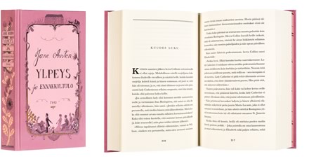
Jane Austen
Ylpeys ja ennakkoluulo
- Published by Teos Publishers
- Graphic design Elina Warsta
- Printed and bound by Bookwell Oy
- Paper Enso Creamy 70 g/m2
- Typeface Baskerville
The new translation of a forever young book is coated with the dreams of a young woman. The sympathetically clumsy handwritten ornamental text on the cover and title page reminds of a diary. The compactly square format, delicious foiled spine and flexible matte paper inspire the reader to touch and read the book.
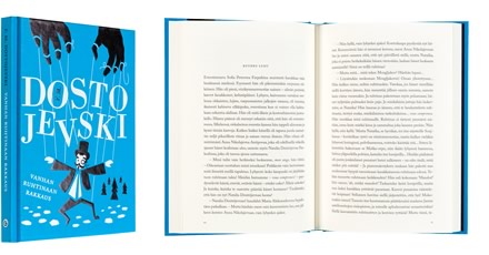
Fjodor Dostojevski
Vanhan ruhtinaan rakkaus
- Published by Gummerus Kustannus Oy
- Graphic design Tuomo Parikka
- Printed and bound by Bookwell Oy
- Paper Munken Premium Cream 100 g/m2
- Typeface Adobe Caslon
The typography and illustration on the cover support each other seamlessly and give this classic book a modern and fresh appearance. The soft dust jacket blends in well with the black and white foil stamping. The overall appearance is diginified and carefully designed. The typography inside the book reflects the spirit of the cover.
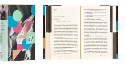
Miki Liukkonen
Lapset auringon alla
- Published by WSOY
- Graphic design Jussi Karjalainen
- Reproduced by Bookwell Oy
- Printed and bound by Bookwell Oy
- Paper Ensocream 70 g/m2, pv-offset 140 g/m2, geltex
- Typeface Minion Pro 9,85/13,5, Trade Gothic 17,5/13,5
The yellow color picked out from the story burns on the cover and endpages like fire in a stove. The appeal of the dust jacket is based on an impression of depth, which is born from the way in which the vividness and geometric pattern play together. The coloring on the page edges cleverly reveals the two parts of the book. The size, a little smaller than usual, feels good in the hand and the peaceful text columns are pleasant to read. The graphic design reflects contemporary times without indulging in trendiness.
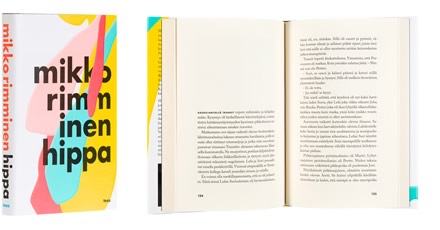
Mikko Rimminen
Hippa
- Published by Teos Publishers
- Graphic design Johannes Nieminen
- Printed and bound by Bookwell Oy
- Paper Enso Creamy 70 g/m2
- Typeface Futura Std, Adobe Caslon Pro
A book begins from the cover, and this one certainly takes off with a speedy start. The author’s unique sense of humor is vivaciously conveyed to the reader through the design. Colorful paint trickles freely on the cover, but the sturdy, black typeface keeps the overall appearance balanced. The book is carefully refined as a whole; the materials and technical print solutions support the theme of the cover.
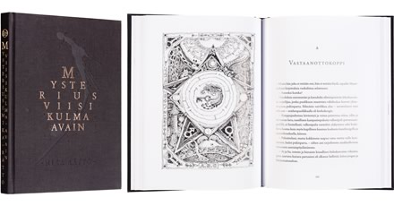
Mika Rättö
Mysterius viisikulma-avain
- Published by Teos Publishers
- Graphic design Jenni Saari
- Printed and bound by Bookwell Oy
- Paper G-Print matt 115 g/m2
- Typeface Old Claude, Adobe Caslon Pro
The black cloth cover with its blind blocking speak of a mirthful reflection on human existence. The echoless churchbells in the beginning and the end lead up to the stories, whose absurd perspective is complemented by the writer’s surreal black and white drawings. The letters dispersed within the rich graphic content and the text, which at times transforms into dada or disappears in emptiness, offer a compelling contrast to the otherwise classical typography.
Harry Salmenniemi
Kivirivit
- Published by Otava Publishing Company Ltd
- Graphic design Markus Pyörälä
- Reproduced by Aste Kirjat Oy
- Printed and bound by Otava Book Publishing Ltd
- Paper LuxCream 2.0 90 g/m2, Scandia 2000 natural 120 g/m2, Lumiart Gloss 130 g/m2
- Typeface Linotype Centennial, Centennial Small Caps & Oldstyle Figures
Perfection doesn’t mean that nothing more needs to be added but that nothing needs to be removed. The design of this poetry book is realized by making use of the text therein: a layered sum total of the typesetting. One elegant typeface, one print color, aside from the black of the text. The covers turn into true frames for the text and takes the book’s objective essence almost to a mystical level as content and form are bound into one.
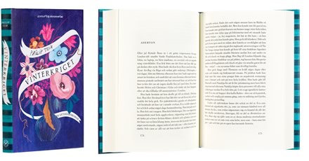
Philip Teir
Vinterkriget
- Published by Schildts & Söderströms
- Graphic design Hanna Lahdenperä
- Cover design Sanna Mander
- Printed and bound by Bookwell Oy
- Paper Munken Book
- Typeface Bodoni
Can the contrast between the title and the appearance of a book get any stronger than this? Even though Vinterkriget (trans. Winter War) does not deal with the years of war, the juxtaposition touches and calls attention to the lovely details on the cover. The flower arrangement comes alive through the brilliant choice of paper, the spot varnish on the handwritten text band seduces the fingers. The text ribbon is repeated in the jacket and the title page, alternating with the catchy stripe theme.
