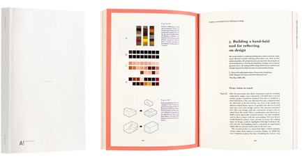
Tero Heikkinen
Design Credo
- Published by Aalto University / Aalto ARTS Books
- Graphic design Jenni Viitanen
- Printed and bound by Unigrafia Oy
- Paper Munken Print Cream 300 g/m2, Munken Pure 130 g/m2, Colorit 120 g/m2
- Typeface Bembo Std, Fugue
Dissertations are sometimes perceived as boring and dry, but they need not look it. The beauty of Tero Heikkinen’s Design Credo slowly creeps in to finally captivate the reader. The blind blocking on the cover has the patience to wait for discovery, the underlying idea of the column layout reveals itself over time, and the typeface, which may appear a bit clumsy at first glance, is endearing with its silly lower-case g:s. Brilliant combinations all the way through.
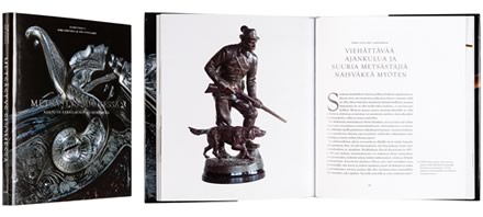
Kari Hintsala - Iiro Kuuranne
Metsästys Suomessa
- Published by The Finnish Literature Society
- Graphic design Timo Numminen
- Photography Martti Puhakka / The Museum Centre of Turku
- Reproduced by Keski-Suomen Sivu Oy
- Printed by Saarijärven Offset Oy
- Paper Arctic Volume W 150 g/m2, Geltex 111 FA, Geltex 11 LS, Multiart Gloss 200 g/m2
- Typeface Goudy Old Style T, Scala Sans OT
A successful case of creating a book with a handsome appearance on a traditional topic. The ornamental close-up photo on the cover is justifiably supported by the foiling, which effectively repeats the metal-shiny theme of the book. The interesting photos have been cropped boldly. The layout is composed, calm and airy.
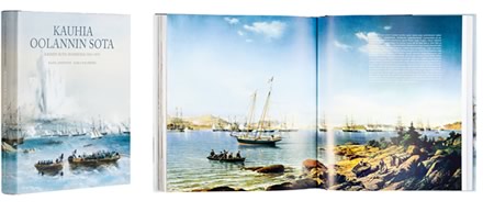
Raoul Johnsson - Ilkka Malmberg
Kauhia Oolannin sota - Krimin sota Suomessa 1854-1855
- Published by John Nurminen Foundation
- Graphic design Tommi Jokivaara
- Printed by Lönnberg Painot Oy
- Bound by Finnreklama Oy
- Paper Multiart silk 150 g/m2
- Typeface Adobe Caslon Pro, Stone Sans II
A comprehensive and impressive book about the upheavals in Finland linked to the Crimean War, which many know by name but may not be well acquainted with. The marvelous illustrations capture the reader in their grip, the fine reproduction work is pleasing to the eye, the paper and binding are lovely. The classic typeface makes it a pleasure to read the book. The decorative, italic swash initials are a small, special detail that also deserves mention.
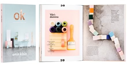
Riikka Kantinkoski - Susanna Vento
OK. Omin käsin
- Published by WSOY
- Graphic design Annukka Saikkonen / Nimiö
- Photography Riikka Kantinkoski
- Reproduced by Aste Kirjat Oy
- Printed and bound by Livonia Print
- Paper G-Print 150 g/m2, GaleriArt Gloss 130 g/m2
- Typeface Austin, Futura BQ, Bell
The pastel colors of the book gain posture from the black and the fashionable copper color. The interior design ideas and DIY instructions fall naturally in with the composition of the illustrations, the pages are carefully thought-out like posters. The fresh and luminous, modernly relaxed appearance offers inspiration, but one can also just enjoy looking at the book and leave the doing itself at the level of thought.
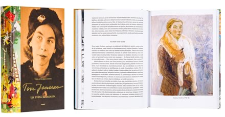
Tuula Karjalainen
Tove Jansson
- Published by Tammi Publishers
- Graphic design Timo Numminen
- Reproduced by Keski-Suomen Sivu Oy
- Printed and bound by Livonia Print
- Paper Amber Graphic 140 g/m2
- Typeface Caecilia
When Finland’s great artist Tove Jansson looks iconically in the photos like herself and the colorful Moomin illustrations will fascinate any reader, one could get the impression that the design of the book’s appearance was born on its own. It is however the ingenuous way in which the illustrations are connected to the jacket and the text printed in gold that turns the dust jacket into a harmonious whole. The modern font used inside the book forgets about any undue pretentiousness and compels to read this richly illustrated book.
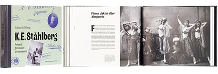
Sabira Ståhlberg
K. E. Ståhlberg
- Published by The Society of Swedish Literature in Finland
- Graphic design Camilla Pentti
- Printed by Oy Nord Print Ab
- Paper Scandia 2000 Smooth Natural
- Typeface Quadraat
This biography is an impressive reading and viewing experience. The charming cover, the overall appearance – verging on perfection – the typography that makes use of contrasts, and the variant use of a five-column layout base offer the reader a journey back in time to a Helsinki of horse-drawn carriages and the first auto-mobiles to arrive in the city. The four-color printed black and white photos by a versatile cultural personage from last century spread out on the pages in refined colors.
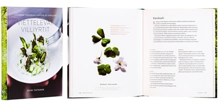
Jouni Toivanen
Viettelevät villiyrtit
- Published by Teos Publishers
- Graphic design Minna Luoma / Candy Graphics
- Reproduced by Timo Lagerström
- Printed and bound by Bookwell Oy
- Paper Arctic Volume 130 g/m2
- Typeface Scala, Fabiol, Gotham
The mysterious atmosphere of the forest with its smells and colors holds the reader in its grip from the very start. The artistically realized photos of the wild herbs are picturesque. All the plants have been photographed separately and clipped to offer a contrast to the full-page food photos. The image processing and color management are skillfully realized in every respect. The stylish appearance perfectly coincides with the topic.
