Jenna Kiuru – Maria Manninen – Johanna Valkola
Arkivé Atelier – Huolla – Vaatteet, kengät, asusteet
- Published by Gummerus Publishers
- Graphic design Tuomas Pajuniemi
- Photographs and layout Tuomas Pajuniemi and Jenna Kiuru
- Reproduced by Tuomas Pajuniemi
- Printed and bound by Jelgavas Tipogrāfija
- Paper Munken Lynx 120 g/m2 ja 150 g/m2
- Typeface Bembo, Borgia
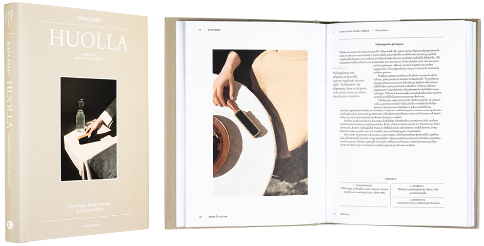
A stylish book about a mundane topic is clear and modern as suits the subject. Design in both pictures and advice is pleasing and calm, tidy as the title suggests. Unfortunately the typeface size is irritatingly small, even though there would have been space available.
Erich Berger – Kasperi Mäki-Reinikka – Kira O’Reilly – Helena Sederholm (Eds.)
Art as We Don’t Know It
- Published by Aalto ARTS Books
- Graphic design Safa Hovinen / Merkitys
- Printed and bound by Printon AS
- Paper Galerie Art Volume 135 g/m2
- Typeface GT America, Meek Display, Warnock
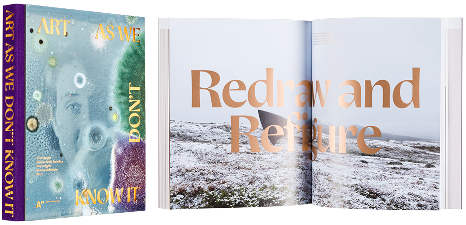
The wide visual variety on this book about bioart has been brought together via sensible layout, airy typesetting and an unexpected additional colour joining together the parts. Repeating beauty of foil print, bravely used even with small type, has succeeded perfectly. Mystical cover, lilac calico back and endpages supplement the trim appearance.
Mia Meri
Egypti – Kala sarkofagissa & muita mysteereitä
- Published by The Finnish Literature Society
- Graphic design Ilona Ilottu / Dog Design
- Reproduced by Kari Lahtinen
- Printed and bound by Livonia Print Ltd
- Paper Munken Polar 150 g/m2, Invercote Creato 300 g/m2
- Typeface Sang Bleu Republic, Sang Bleu Kingdom
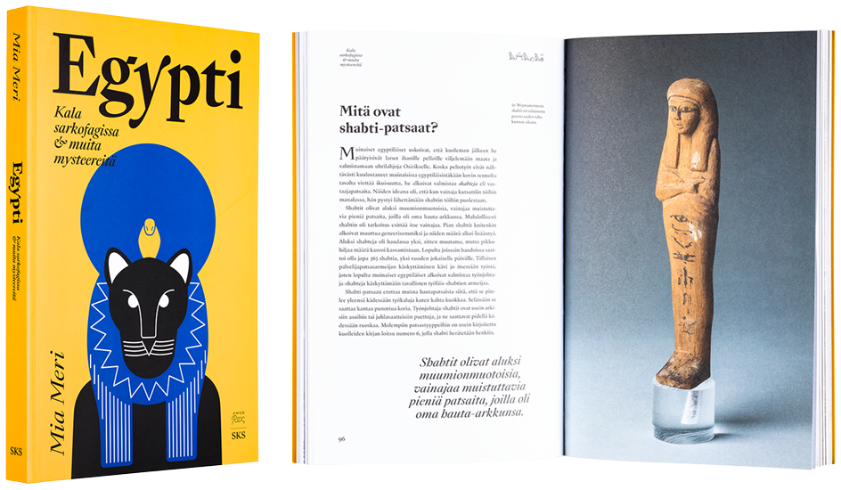
The visual style of this standalone textbook published in connection with Amos Rex’ exhibition Egypt of Glory follows the design of the exhibition, also by Dog Design. The same modern Egyptian characters delight here, too. Between the pictorial and the literary is a fine contrast, finalised by skillful typography.
Marika Bogren – Veikko Halmetoja – Harri Kalha – Timo Keinänen – Kaisa Koivisto – Uta Laurén – Helena Leppänen – Elina Melgin – Hannele Nyman – Jennifer Opie – Tauno Tarna – Susann Vihma – Tapio Yli-Viikari – Laura Kolbe
Lasin ja keramiikan mestarit 1–6
- Published by Parvs Publishing Ltd and Collection Kakkonen
- Graphic design Aki Suvanto ja Aleksi Kuokka / Aivan Oy
- Illustration Vappu Rossi
- Photography Rauno Träskelin
- Reproduced by Kari Lahtinen / BNW
- Printed and bound by Livonia Print Ltd
- Paper Munken Lynx 150 g/m2
- Typeface Kakkonen Sans, Kakkonen Craft
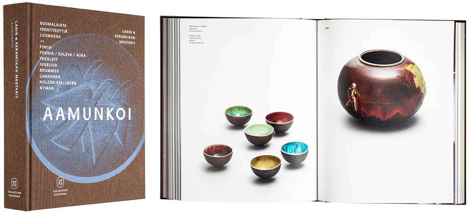
The impressive glass and ceramics collection of Commercial Counsellor Kyösti Kakkonen has been sturdily packed together in six large volumes weighing all combined over 15 kilograms. No resource has been spared, and the materials are of good quality and aesthetically pleasing. A special, angled font family has been created for the book, Kakkonen Sans and Kakkonen Craft. Covers of the series form an uniform entity. Both text and pictures continue boldly over the spread, which has on occasion led to parts of elements on inside margin disappearing in the spine.
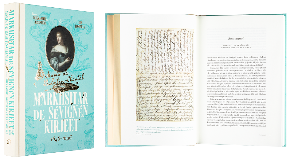
Riikka-Maria Rosenberg – Ulla Tuomarla (Eds.)
Markiisitar de Sévignén kirjeet 1648–1696
- Published by Kustannusosakeyhtiö Teos
- Graphic design Jenni Saari
- Reproduced by Meedia Zone, Viro
- Printed, reproduced and bound by Meedia Zone OÜ
- Paper Munken Pure 1.3 80 g/m2
- Typeface Granjon LT Std, Bauer Bodoni Std
Book is an uniform entity created with meticulous care and both its form and choice of materials successfully reflect the content. Paper used on book block has an especially beautiful shade, unfortunately the paper is annoyingly transparent. Skillful typography and polished layout in shades of powder create a fine bridge to the period in question.
