Eeva Hannula
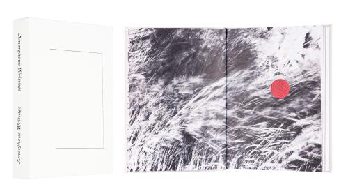
Amorphous Writings
- Published by Self-published
- Graphic design Tytti Halonen
- Illustration and photography Eeva Hannula
- Reproduced by Petri Kuokka
- Printed by Tallinna Raamatutrükikoda
- Paper Munken Lynx Rough 120 g/m2 and Munken Lynx Rough 150 g/m2
- Typeface wwwaaa, Clifton
A backwards-forwards book combining photography and poetry, Amorphous Writings can be read from both directions without the minimalist cover setting a preference. One direction offers the photography as a storyline, the other the text. Meticulous design in both, and the red highlight colour create together an airy rhythm where spreads intensively packed and spacious alternate.

Pilvi Kalhama - Päivi Karttunen - Mami Kataoka - Inka Laine - Arja Miller
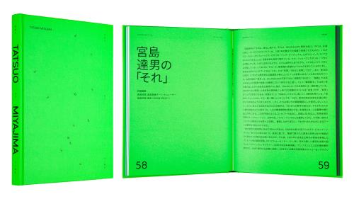
Tatsui Miyajima: Sky of Time
- Published by EMMA Espoo Museum of Modern Art
- Graphic design Tony Eräpuro, Vesa Viljakainen / Kuudes
- Cover graphic design Tony Eräpuro / Kuudes
- Photography Ari Karttunen / EMMA
- Reproduced by Asko Rokala / BEE2 Oy
- Printed by Grano Oy
- Bound by Finnreklama Oy
- Paper Munken Kristall Rough 150 g/m2
- Typeface GT Cinetype, Noto Sans CSK JP
The iridescent green and the mechanical typographic shapes create a connection with Tatsuo Miyajima’s Sky of Time exhibition of luminescent green LEDdisplays. Green really shines on the cover, endleaves, bookblock and dyed page edges.

Jaakko Mattila
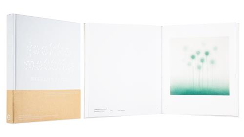
Works on Paper
- Published by Garret Publications
- Printed and reproduced by Göteborgs Tryckeriet
- Graphic design Ellaveera Björk
- Photography Sami Kulju
- Paper Munken Pure Rough 90 g/m2, Munken Polar Rough 120 g/m2, Kraft Liner Paper 115 g/m2
- Typeface Jaakkojaakko, Bookish, HTS One
Massive outer shape of the book with its brown paper obi belt hides within a different world, airy and clean. Art is technically demanding, but the layout is well-paced, shades reproduce perfectly, and the successful choice of paper with its stylish typography finish the beautiful package.

Paula Toppila (Toim./Ed.), Taidesäätiö Pro Arte
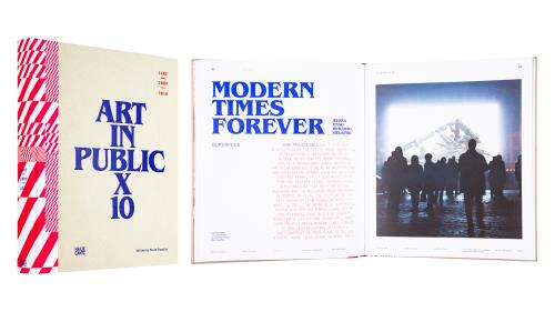
Art in Public X 10 IHME 2009-2018
- Published by Hatje Cantz Verlag
- Graphic design Ilona Ilottu / Dog Design
- Photography Veikko Somerpuro, Kai Widell et al.
- Reproduced by Asko Rokala / BEE2 Oy
- Printed by GRASPO CZ, A.S.
- Paper Olin Smooth High White 150 g/m2
- Typeface Optimo CEO, Benquiat, Kepler Std
This dynamic and airy tome presents the Contemporary Art festival IHME. Massive headline is tuned with light, rhythmic lead, and there’s plenty of space around the text body. Alternating red and blue type is both practical and beautiful. Meticulous details, functional use of space, quality print and beautiful matte paper form a modern, stylish entity.

