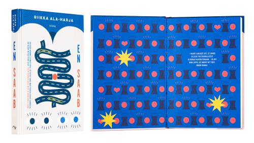
Riikka Ala-Harja
En Saab
- Published by Otava Publishing Company
- Graphic design Jussi Karjalainen
- Reproduced by Aste Kirjat Oy
- Printed by Otavan kirjapaino
- Paper Geltex
- Typeface Lulo Clean One Bold, Alternate Gothick No1
Fresh and unashamed little book fits well in hand. The playful pictorial and sturdy typography continue from the cover into the verso pages and the title page. The neat binding carries itself well and finishes the package.
But why not reveal the designer’s name?
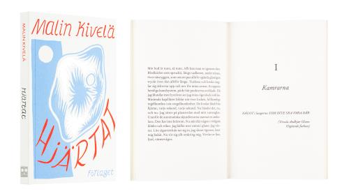
Malin Kivelä
Hjärtat
- Published by Förlaget
- Graphic design Ulla Donner
- Photography Niklas Sandström
- Printed by Nord Print
- Paper Munken print cream 115 g/m2
- Typeface Fournier
A charming and original pearl of literature, Hjärtat gets its character through the beautiful details in binding and the quality of materials used.
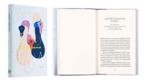
Laura Lindstedt
Ystäväni Natalia
- Published by Teos Publishers
- Printed by Scandbook UAB
- Graphic design Jussi Karjalainen
- Illustration and photography Jarkko Mikkonen (author photo)
- Paper Enso Creamy 70 g/m2
- Typeface Jaapokki, Minion Pro
Both the cover art and the choice of materials support each other in this wholesome entity. The cover subtly reflects the themes, and even though the materials are of standard stock, they are well selected and create a special book object.
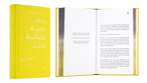
Meiju Niskala
Sata kirjettä kuolleelle äidille
- Published by WSOY
- Graphic design Jenni Erkintalo
- Reproduced by Keski-Suomen Sivu Oy
- Printed by Livonia Print
- Paper Munken Lynx 130 g/m2
- Typeface Sabon LT Std, Brandon Grotesque
The yellow of the calico cover continues well into the book, whether in a cloud of fog, whether in small specks. It runs as a stripe on the outer edge of pages, plays with the black occasionally immersing into it. Text pages are airy and what is said is accented by typography. Gold print on cover gives a finishing touch to this warm-glowing book.
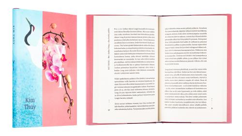
Kim Thúy
Vi
- Published by Gummerus Publishers
- Cover graphic design Sanna-Reeta Meilahti
- Printed by ScandBook
- Paper Munken Lynx 150 g/m2, Enso Creamy 70 g/m2
- Typeface Minion Pro Regular, Myriad Pro Regular
Cover pictures combine innovatively into the image of a crane. Typography is natural and effortless. Wide margin space of the pages is in balance with the type and other graphic elements, and the result is gentle and beautiful, from the covers to the contents.
